Your app works. But it feels flat. Buttons appear instantly. Screens switch without transition. Content pops in and out like a slideshow from 2005.
Animations fix that. They make your app feel smooth, polished, and alive — like a well-made product instead of a homework assignment.
The good news: Compose makes animations surprisingly easy. You can add most animations with a single line of code.
The Animation API at a Glance
Compose has several animation APIs, each for a different use case:
| API | What It Does | When to Use |
|---|---|---|
AnimatedVisibility | Show/hide with animation | Appearing/disappearing elements |
animateAsState | Animate a single value | Color, size, offset changes |
AnimatedContent | Animate between different content | Switching text, icons, layouts |
Crossfade | Fade between two layouts | Simple content switching |
animateContentSize | Auto-animate size changes | Expanding/collapsing cards |
Modifier.animateItemPlacement() | Animate list item reorder | LazyColumn reorder |
Let’s learn each one.
AnimatedVisibility — Show and Hide with Style
The most commonly used animation. Wrap any Composable with AnimatedVisibility and it animates in and out:
@Composable
fun ToggleMessage() {
    var isVisible by remember { mutableStateOf(false) }

    Column {
        Button(onClick = { isVisible = !isVisible }) {
            Text(if (isVisible) "Hide" else "Show")
        }

        AnimatedVisibility(visible = isVisible) {
            Text(
                "Hello! I fade in and out smoothly.",
                modifier = Modifier
                    .fillMaxWidth()
                    .background(MaterialTheme.colorScheme.primaryContainer)
                    .padding(16.dp)
            )
        }
    }
}
By default, AnimatedVisibility uses fade + expand. You can customize it:
Custom Enter and Exit Animations
AnimatedVisibility(
    visible = isVisible,
    enter = slideInVertically() + fadeIn(),
    exit = slideOutVertically() + fadeOut()
) {
    Text("I slide in from the top and fade in")
}
Available enter animations:
fadeIn()— fade from transparentslideInVertically()— slide from top or bottomslideInHorizontally()— slide from left or rightexpandVertically()— expand from zero heightexpandHorizontally()— expand from zero widthscaleIn()— grow from small to full size
You can combine them with +:
// Slide from bottom + fade in at the same time
enter = slideInVertically { it } + fadeIn()

// Scale down + fade out at the same time
exit = scaleOut() + fadeOut()
Practical Example: Expandable Card
@Composable
fun ExpandableCard(title: String, content: String) {
    var isExpanded by remember { mutableStateOf(false) }

    Surface(
        modifier = Modifier
            .fillMaxWidth()
            .clickable { isExpanded = !isExpanded },
        shape = RoundedCornerShape(12.dp),
        color = MaterialTheme.colorScheme.surfaceVariant
    ) {
        Column(modifier = Modifier.padding(16.dp)) {
            Row(verticalAlignment = Alignment.CenterVertically) {
                Text(
                    title,
                    style = MaterialTheme.typography.titleMedium,
                    modifier = Modifier.weight(1f)
                )
                Icon(
                    imageVector = if (isExpanded) Icons.Default.KeyboardArrowUp
                    else Icons.Default.KeyboardArrowDown,
                    contentDescription = if (isExpanded) "Collapse" else "Expand"
                )
            }

            AnimatedVisibility(
                visible = isExpanded,
                enter = expandVertically() + fadeIn(),
                exit = shrinkVertically() + fadeOut()
            ) {
                Text(
                    content,
                    modifier = Modifier.padding(top = 8.dp),
                    color = MaterialTheme.colorScheme.onSurfaceVariant
                )
            }
        }
    }
}
Tap the card → content expands smoothly. Tap again → it collapses. One AnimatedVisibility does all the work.
animateAsState — Animate Single Values
When you want to animate a color, size, position, or any single value:
@Composable
fun AnimatedButton() {
    var isSelected by remember { mutableStateOf(false) }

    // These values animate smoothly when isSelected changes
    val backgroundColor by animateColorAsState(
        targetValue = if (isSelected) MaterialTheme.colorScheme.primary
        else MaterialTheme.colorScheme.surfaceVariant,
        label = "backgroundColor"
    )

    val cornerRadius by animateDpAsState(
        targetValue = if (isSelected) 24.dp else 8.dp,
        label = "cornerRadius"
    )

    val textColor by animateColorAsState(
        targetValue = if (isSelected) MaterialTheme.colorScheme.onPrimary
        else MaterialTheme.colorScheme.onSurfaceVariant,
        label = "textColor"
    )

    Surface(
        modifier = Modifier
            .fillMaxWidth()
            .clickable { isSelected = !isSelected },
        shape = RoundedCornerShape(cornerRadius),
        color = backgroundColor
    ) {
        Text(
            text = if (isSelected) "Selected" else "Tap to Select",
            color = textColor,
            modifier = Modifier.padding(16.dp),
            fontWeight = if (isSelected) FontWeight.Bold else FontWeight.Normal
        )
    }
}
When isSelected changes, all three values animate simultaneously: the background color, corner radius, and text color smoothly transition to their new values.
Available animate*AsState Functions
| Function | Animates |
|---|---|
animateColorAsState | Colors |
animateDpAsState | Dp values (size, padding, offset) |
animateFloatAsState | Float values (alpha, scale, rotation) |
animateIntAsState | Integer values |
animateOffsetAsState | X/Y positions |
animateSizeAsState | Width/height pairs |
Custom Animation Speed
val size by animateDpAsState(
    targetValue = if (isExpanded) 200.dp else 50.dp,
    animationSpec = tween(
        durationMillis = 300,  // 300ms duration
        easing = FastOutSlowInEasing  // Smooth curve
    ),
    label = "size"
)
Common animation specs:
tween(durationMillis = 300)— fixed duration animationspring(dampingRatio = 0.7f)— bouncy spring animationsnap()— instant, no animationrepeatable(iterations = 3, animation = tween(200))— repeat N timesinfiniteRepeatable(animation = tween(1000))— loop forever
animateContentSize — Auto-Animate Size Changes
The easiest animation. Just add the modifier — Compose handles the rest:
@Composable
fun ExpandableText() {
    var isExpanded by remember { mutableStateOf(false) }

    Text(
        text = "This is a long text that demonstrates animateContentSize. " +
            "When you tap it, it expands to show the full content. " +
            "The size change is animated automatically. " +
            "No manual animation code needed at all. Just the modifier.",
        maxLines = if (isExpanded) Int.MAX_VALUE else 2,
        overflow = TextOverflow.Ellipsis,
        modifier = Modifier
            .fillMaxWidth()
            .animateContentSize(  // This one modifier does everything
                animationSpec = spring(dampingRatio = Spring.DampingRatioLowBouncy)
            )
            .clickable { isExpanded = !isExpanded }
            .padding(16.dp)
    )
}
animateContentSize() measures the content before and after the change, then smoothly animates between the two sizes. Perfect for expanding cards, growing text, and resizable containers.
AnimatedContent — Animate Between Different Content
When you want to switch between different Composables with animation:
@Composable
fun AnimatedCounter() {
    var count by remember { mutableStateOf(0) }

    Column(horizontalAlignment = Alignment.CenterHorizontally) {
        AnimatedContent(
            targetState = count,
            transitionSpec = {
                // New number slides in from bottom, old slides out to top
                slideInVertically { it } + fadeIn() togetherWith
                    slideOutVertically { -it } + fadeOut()
            },
            label = "counter"
        ) { targetCount ->
            Text(
                text = "$targetCount",
                fontSize = 64.sp,
                fontWeight = FontWeight.Bold,
                color = MaterialTheme.colorScheme.primary
            )
        }

        Row(horizontalArrangement = Arrangement.spacedBy(8.dp)) {
            Button(onClick = { count-- }) { Text("-") }
            Button(onClick = { count++ }) { Text("+") }
        }
    }
}
Each time count changes, the old number slides out and the new number slides in. This looks much better than just changing the text instantly.
AnimatedContent for Switching Views
@Composable
fun TabContent(selectedTab: Int) {
    AnimatedContent(
        targetState = selectedTab,
        transitionSpec = {
            // Slide direction based on which tab was selected
            if (targetState > initialState) {
                slideInHorizontally { it } + fadeIn() togetherWith
                    slideOutHorizontally { -it } + fadeOut()
            } else {
                slideInHorizontally { -it } + fadeIn() togetherWith
                    slideOutHorizontally { it } + fadeOut()
            }
        },
        label = "tabContent"
    ) { tab ->
        when (tab) {
            0 -> HomeContent()
            1 -> SearchContent()
            2 -> ProfileContent()
        }
    }
}
The content slides left or right depending on whether you go to a higher or lower tab index.
Crossfade — Simple Content Switching
Crossfade is a simpler version of AnimatedContent — it just fades between two layouts:
@Composable
fun LoadingScreen(isLoading: Boolean) {
    Crossfade(
        targetState = isLoading,
        animationSpec = tween(300),
        label = "loading"
    ) { loading ->
        if (loading) {
            Box(
                modifier = Modifier.fillMaxSize(),
                contentAlignment = Alignment.Center
            ) {
                CircularProgressIndicator()
            }
        } else {
            // Your actual content
            Text("Data loaded!")
        }
    }
}
Use Crossfade when you just need a fade transition. Use AnimatedContent when you need slide, scale, or custom transitions.
Practical Example: Animated Settings Screen
Let’s combine multiple animations in one real screen:
@Composable
fun AnimatedSettingsScreen() {
    var darkMode by remember { mutableStateOf(false) }
    var notifications by remember { mutableStateOf(true) }
    var fontSize by remember { mutableStateOf(16f) }
    var showAdvanced by remember { mutableStateOf(false) }

    // Animated background color
    val backgroundColor by animateColorAsState(
        targetValue = if (darkMode) Color(0xFF121212) else Color.White,
        animationSpec = tween(500),
        label = "bg"
    )

    Column(
        modifier = Modifier
            .fillMaxSize()
            .background(backgroundColor)
            .padding(16.dp),
        verticalArrangement = Arrangement.spacedBy(16.dp)
    ) {
        Text("Settings", style = MaterialTheme.typography.headlineLarge)

        // Dark mode toggle with animated icon
        Row(
            modifier = Modifier.fillMaxWidth(),
            verticalAlignment = Alignment.CenterVertically
        ) {
            AnimatedContent(
                targetState = darkMode,
                label = "icon"
            ) { isDark ->
                Icon(
                    imageVector = if (isDark) Icons.Default.DarkMode
                    else Icons.Default.LightMode,
                    contentDescription = null,
                    modifier = Modifier.size(24.dp)
                )
            }

            Spacer(modifier = Modifier.width(12.dp))
            Text("Dark Mode", modifier = Modifier.weight(1f))
            Switch(checked = darkMode, onCheckedChange = { darkMode = it })
        }

        // Notifications toggle
        Row(
            modifier = Modifier.fillMaxWidth(),
            verticalAlignment = Alignment.CenterVertically
        ) {
            Text("Notifications", modifier = Modifier.weight(1f))
            Switch(checked = notifications, onCheckedChange = { notifications = it })
        }

        // Font size with animated preview
        Text("Font Size: ${fontSize.toInt()}sp")
        Slider(
            value = fontSize,
            onValueChange = { fontSize = it },
            valueRange = 12f..32f
        )

        // Animated font preview
        val animatedFontSize by animateFloatAsState(
            targetValue = fontSize,
            animationSpec = spring(dampingRatio = Spring.DampingRatioMediumBouncy),
            label = "fontSize"
        )
        Text(
            "Preview Text",
            fontSize = animatedFontSize.sp,
            fontWeight = FontWeight.Medium
        )

        // Show/hide advanced settings
        OutlinedButton(onClick = { showAdvanced = !showAdvanced }) {
            Text(if (showAdvanced) "Hide Advanced" else "Show Advanced")
        }

        AnimatedVisibility(
            visible = showAdvanced,
            enter = expandVertically() + fadeIn(),
            exit = shrinkVertically() + fadeOut()
        ) {
            Column(
                modifier = Modifier
                    .fillMaxWidth()
                    .background(
                        MaterialTheme.colorScheme.surfaceVariant,
                        RoundedCornerShape(12.dp)
                    )
                    .padding(16.dp),
                verticalArrangement = Arrangement.spacedBy(8.dp)
            ) {
                Text("Advanced Settings", fontWeight = FontWeight.Bold)
                Text("Cache size: 256 MB")
                Text("Debug mode: Off")
                Text("API endpoint: production")
            }
        }
    }
}
This screen has:
- Animated background color when dark mode toggles
- AnimatedContent for the dark/light mode icon
- Animated font size preview with spring physics
- AnimatedVisibility for the advanced settings section
Common Mistakes
Mistake 1: Animating Without a Key Change
// BAD — animation never triggers because nothing changes
val color by animateColorAsState(
    targetValue = Color.Red, // Always red — no animation
    label = "color"
)

// GOOD — animation triggers when isError changes
val color by animateColorAsState(
    targetValue = if (isError) Color.Red else Color.Green,
    label = "color"
)
Mistake 2: Missing the label Parameter
// BAD — compiler warning, harder to debug
val size by animateDpAsState(targetValue = 100.dp)

// GOOD — label helps identify animations in debugging tools
val size by animateDpAsState(targetValue = 100.dp, label = "cardSize")
Mistake 3: Over-Animating
Not everything needs animation. Animate meaningful state changes (expand/collapse, show/hide, selection). Don’t animate every color change and padding adjustment — it makes the UI feel sluggish.
Mistake 4: Using infiniteRepeatable Without Stopping
// BAD — animates forever, wastes battery
val alpha by animateFloatAsState(
    targetValue = 1f,
    animationSpec = infiniteRepeatable(tween(1000)),
    label = "alpha"
)

// GOOD — use InfiniteTransition for intentional infinite animations
val infiniteTransition = rememberInfiniteTransition(label = "pulse")
val alpha by infiniteTransition.animateFloat(
    initialValue = 0.3f,
    targetValue = 1f,
    animationSpec = infiniteRepeatable(
        animation = tween(1000),
        repeatMode = RepeatMode.Reverse
    ),
    label = "pulseAlpha"
)
Quick Reference
| What You Want | API to Use |
|---|---|
| Show/hide an element | AnimatedVisibility(visible = show) { content } |
| Animate a color | animateColorAsState(if (x) Red else Blue) |
| Animate a size | animateDpAsState(if (x) 200.dp else 50.dp) |
| Auto-animate size changes | Modifier.animateContentSize() |
| Switch between content | AnimatedContent(targetState = x) { } |
| Fade between content | Crossfade(targetState = x) { } |
| Animate list item reorder | Modifier.animateItemPlacement() |
Result
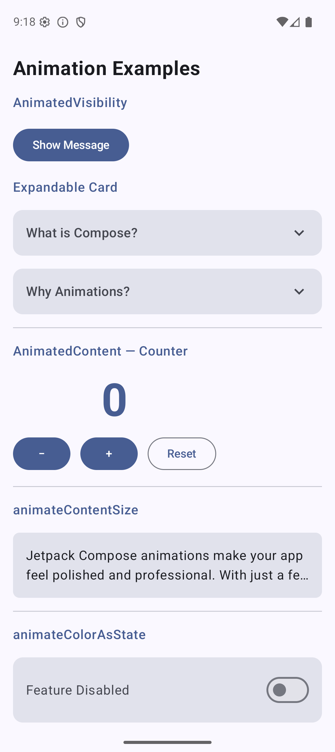
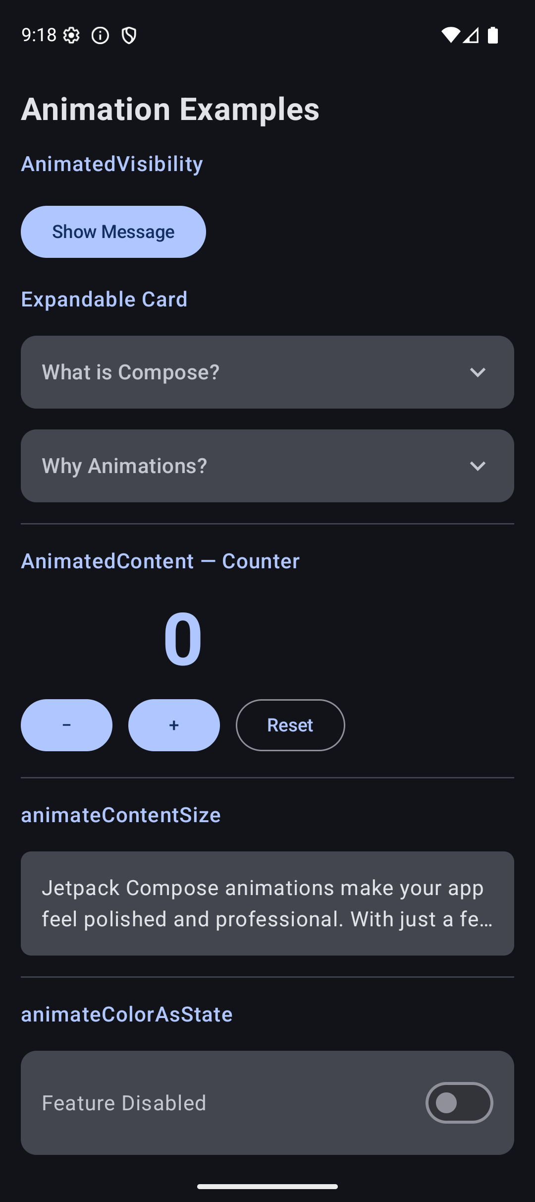
Here is what the app looks like when you run the code from this tutorial:
| Light Mode | Dark Mode |
|---|---|
 |  |
Source Code
The complete working code for this tutorial is on GitHub:
Related Tutorials
- Tutorial #3: Modifiers — the modifiers that animations build on
- Tutorial #5: State — state changes that trigger animations
- Tutorial #7: Theming — animated theme colors
- Jetpack Compose Cheat Sheet — quick reference for every component and modifier.
- Full Series: Jetpack Compose Tutorial — all 25 tutorials from zero to publishing.
What’s Next?
In the next tutorial, we will learn about Custom Layouts and Canvas — drawing your own shapes, progress indicators, and creating layouts that go beyond Column, Row, and Box.
See you there.