You know layouts. You know modifiers. Now let’s learn the components you will use in every single screen — Text, Button, Image, and TextField.
These are the building blocks of every Android app. Get comfortable with them and you can build almost anything.
Text — Showing Words on Screen
You have already used Text, but there is much more to it.
Basic Text
Text("Hello, World!")
Styling Text
Text(
    text = "Styled Text",
    fontSize = 24.sp,
    fontWeight = FontWeight.Bold,
    color = Color.Blue,
    letterSpacing = 1.sp,
    textAlign = TextAlign.Center,
    modifier = Modifier.fillMaxWidth()
)
All the Style Options
| Property | What It Does | Example |
|---|---|---|
fontSize | Text size | 16.sp, 24.sp |
fontWeight | Thickness | FontWeight.Bold, FontWeight.Light |
fontStyle | Italic or normal | FontStyle.Italic |
color | Text color | Color.Red, Color(0xFF333333) |
textAlign | Alignment | TextAlign.Center, TextAlign.End |
letterSpacing | Space between letters | 2.sp |
lineHeight | Space between lines | 28.sp |
maxLines | Maximum number of lines | 1, 3 |
overflow | What happens when text is too long | TextOverflow.Ellipsis |
textDecoration | Underline or strikethrough | TextDecoration.Underline |
Truncating Long Text
When text is too long for the available space:
Text(
    text = "This is a very long text that will not fit on one line and needs to be truncated",
    maxLines = 1,
    overflow = TextOverflow.Ellipsis
)
This shows: “This is a very long text that will not fit on one li…” with three dots at the end.
Multiple Styles in One Text
Use buildAnnotatedString to mix styles:
Text(
    buildAnnotatedString {
        append("Hello, ")
        withStyle(SpanStyle(fontWeight = FontWeight.Bold, color = Color.Blue)) {
            append("World")
        }
        append("! Welcome to ")
        withStyle(SpanStyle(fontStyle = FontStyle.Italic)) {
            append("Compose")
        }
    }
)
This shows “Hello, World! Welcome to Compose” — different styles in one text.
Selectable Text
By default, users cannot select and copy text. To allow it:
SelectionContainer {
    Text("You can select and copy this text")
}
Button — Handling User Taps
Basic Button
Button(onClick = { println("Clicked!") }) {
    Text("Click Me")
}
Every Button needs two things: an onClick function and content inside the curly braces.
Button Types
Compose has several button styles:
// Filled button (primary action)
Button(onClick = {}) {
    Text("Primary")
}

// Outlined button (secondary action)
OutlinedButton(onClick = {}) {
    Text("Secondary")
}

// Text button (low emphasis)
TextButton(onClick = {}) {
    Text("Tertiary")
}

// Filled tonal button (medium emphasis)
FilledTonalButton(onClick = {}) {
    Text("Tonal")
}

// Elevated button (with shadow)
ElevatedButton(onClick = {}) {
    Text("Elevated")
}
Button with Icon
Button(onClick = {}) {
    Icon(
        imageVector = Icons.Default.Add,
        contentDescription = "Add",
        modifier = Modifier.size(18.dp)
    )
    Spacer(modifier = Modifier.width(8.dp))
    Text("Add Item")
}
Icon Button
For buttons that are just an icon (like a toolbar):
IconButton(onClick = {}) {
    Icon(
        imageVector = Icons.Default.Favorite,
        contentDescription = "Like"
    )
}
Floating Action Button
The round button that floats at the bottom of the screen:
FloatingActionButton(onClick = {}) {
    Icon(Icons.Default.Add, contentDescription = "Add")
}
Full Width Button
Button(
    onClick = {},
    modifier = Modifier.fillMaxWidth(),
    shape = RoundedCornerShape(12.dp)
) {
    Text("Submit", modifier = Modifier.padding(vertical = 4.dp))
}
Disabled Button
Button(
    onClick = {},
    enabled = false  // Grayed out, cannot be clicked
) {
    Text("Not Available")
}
Custom Button Colors
Button(
    onClick = {},
    colors = ButtonDefaults.buttonColors(
        containerColor = Color(0xFF6200EE),
        contentColor = Color.White
    )
) {
    Text("Custom Color")
}
Image — Showing Pictures
Image from Resources
Put your image in res/drawable/, then:
Image(
    painter = painterResource(R.drawable.my_photo),
    contentDescription = "A photo",
    modifier = Modifier.size(200.dp)
)
Always provide contentDescription for accessibility. If the image is decorative and does not add information, use null:
Image(
    painter = painterResource(R.drawable.background),
    contentDescription = null  // Decorative only
)
Content Scale
How the image fits inside its container:
Image(
    painter = painterResource(R.drawable.photo),
    contentDescription = "Photo",
    modifier = Modifier
        .fillMaxWidth()
        .height(200.dp),
    contentScale = ContentScale.Crop  // Fill and crop
)
| ContentScale | What It Does |
|---|---|
Crop | Fill the container, crop what doesn’t fit |
Fit | Show the full image, may leave empty space |
FillBounds | Stretch to fill (may distort) |
FillWidth | Fill the width, scale height proportionally |
FillHeight | Fill the height, scale width proportionally |
Inside | Show at original size or smaller |
None | Show at original size |
Circular Image
Image(
    painter = painterResource(R.drawable.profile),
    contentDescription = "Profile picture",
    modifier = Modifier
        .size(80.dp)
        .clip(CircleShape)
        .border(2.dp, MaterialTheme.colorScheme.primary, CircleShape),
    contentScale = ContentScale.Crop
)
Loading Images from the Internet
Compose does not load network images by default. You need a library. The most popular one is Coil:
Add to your build.gradle:
implementation("io.coil-kt:coil-compose:2.6.0")
Then use AsyncImage:
AsyncImage(
    model = "https://example.com/photo.jpg",
    contentDescription = "User photo",
    modifier = Modifier
        .size(100.dp)
        .clip(CircleShape),
    contentScale = ContentScale.Crop
)
Coil handles caching, placeholders, and error states:
AsyncImage(
    model = "https://example.com/photo.jpg",
    contentDescription = "Photo",
    modifier = Modifier.size(200.dp),
    placeholder = painterResource(R.drawable.placeholder),
    error = painterResource(R.drawable.error_image)
)
Icon
For simple icons, use the built-in Material Icons:
Icon(
    imageVector = Icons.Default.Home,
    contentDescription = "Home",
    tint = MaterialTheme.colorScheme.primary,
    modifier = Modifier.size(24.dp)
)
Common icons: Icons.Default.Home, Icons.Default.Search, Icons.Default.Settings, Icons.Default.Person, Icons.Default.Add, Icons.Default.Delete, Icons.Default.ArrowBack, Icons.Default.Favorite.
TextField — Getting User Input
Basic TextField
var text by remember { mutableStateOf("") }

TextField(
    value = text,
    onValueChange = { text = it },
    label = { Text("Enter your name") }
)
Two things are required:
value— the current text (comes from state)onValueChange— what happens when the user types (updates the state)
OutlinedTextField
The outlined version looks cleaner and is more common in modern apps:
var email by remember { mutableStateOf("") }

OutlinedTextField(
    value = email,
    onValueChange = { email = it },
    label = { Text("Email") },
    modifier = Modifier.fillMaxWidth()
)
TextField with Icon
OutlinedTextField(
    value = text,
    onValueChange = { text = it },
    label = { Text("Search") },
    leadingIcon = {
        Icon(Icons.Default.Search, contentDescription = "Search")
    },
    modifier = Modifier.fillMaxWidth()
)
You can also add a trailingIcon (on the right side):
OutlinedTextField(
    value = text,
    onValueChange = { text = it },
    label = { Text("Search") },
    trailingIcon = {
        if (text.isNotEmpty()) {
            IconButton(onClick = { text = "" }) {
                Icon(Icons.Default.Clear, contentDescription = "Clear")
            }
        }
    }
)
Password TextField
var password by remember { mutableStateOf("") }
var passwordVisible by remember { mutableStateOf(false) }

OutlinedTextField(
    value = password,
    onValueChange = { password = it },
    label = { Text("Password") },
    visualTransformation = if (passwordVisible) {
        VisualTransformation.None
    } else {
        PasswordVisualTransformation()
    },
    trailingIcon = {
        IconButton(onClick = { passwordVisible = !passwordVisible }) {
            Icon(
                imageVector = if (passwordVisible) {
                    Icons.Default.Visibility
                } else {
                    Icons.Default.VisibilityOff
                },
                contentDescription = if (passwordVisible) "Hide password" else "Show password"
            )
        }
    },
    modifier = Modifier.fillMaxWidth()
)
Keyboard Options
Control what keyboard shows up:
// Email keyboard
OutlinedTextField(
    value = email,
    onValueChange = { email = it },
    keyboardOptions = KeyboardOptions(
        keyboardType = KeyboardType.Email,
        imeAction = ImeAction.Next
    )
)

// Number keyboard
OutlinedTextField(
    value = age,
    onValueChange = { age = it },
    keyboardOptions = KeyboardOptions(
        keyboardType = KeyboardType.Number,
        imeAction = ImeAction.Done
    )
)
| KeyboardType | Shows |
|---|---|
Text | Normal keyboard |
Number | Number pad |
Phone | Phone dialer layout |
Email | Keyboard with @ symbol |
Password | Text with obscured input |
Uri | Keyboard with / and .com |
| ImeAction | Button on keyboard |
|---|---|
Next | Moves to next field |
Done | Closes keyboard |
Search | Search icon |
Send | Send icon |
Go | Go icon |
Error State
var email by remember { mutableStateOf("") }
var isError by remember { mutableStateOf(false) }

OutlinedTextField(
    value = email,
    onValueChange = {
        email = it
        isError = !it.contains("@")
    },
    label = { Text("Email") },
    isError = isError,
    supportingText = {
        if (isError) {
            Text("Please enter a valid email")
        }
    },
    modifier = Modifier.fillMaxWidth()
)
Practical Example: Login Form
Let’s combine everything into a real login screen:
@Composable
fun LoginScreen() {
    var email by remember { mutableStateOf("") }
    var password by remember { mutableStateOf("") }
    var passwordVisible by remember { mutableStateOf(false) }
    var isLoading by remember { mutableStateOf(false) }

    Column(
        modifier = Modifier
            .fillMaxSize()
            .padding(24.dp),
        verticalArrangement = Arrangement.Center
    ) {
        // Title
        Text(
            text = "Welcome Back",
            fontSize = 28.sp,
            fontWeight = FontWeight.Bold
        )

        Text(
            text = "Sign in to continue",
            fontSize = 16.sp,
            color = MaterialTheme.colorScheme.onSurfaceVariant
        )

        Spacer(modifier = Modifier.height(32.dp))

        // Email field
        OutlinedTextField(
            value = email,
            onValueChange = { email = it },
            label = { Text("Email") },
            leadingIcon = {
                Icon(Icons.Default.Email, contentDescription = null)
            },
            keyboardOptions = KeyboardOptions(
                keyboardType = KeyboardType.Email,
                imeAction = ImeAction.Next
            ),
            singleLine = true,
            modifier = Modifier.fillMaxWidth()
        )

        Spacer(modifier = Modifier.height(16.dp))

        // Password field
        OutlinedTextField(
            value = password,
            onValueChange = { password = it },
            label = { Text("Password") },
            leadingIcon = {
                Icon(Icons.Default.Lock, contentDescription = null)
            },
            trailingIcon = {
                IconButton(onClick = { passwordVisible = !passwordVisible }) {
                    Icon(
                        imageVector = if (passwordVisible) {
                            Icons.Default.Visibility
                        } else {
                            Icons.Default.VisibilityOff
                        },
                        contentDescription = null
                    )
                }
            },
            visualTransformation = if (passwordVisible) {
                VisualTransformation.None
            } else {
                PasswordVisualTransformation()
            },
            keyboardOptions = KeyboardOptions(
                keyboardType = KeyboardType.Password,
                imeAction = ImeAction.Done
            ),
            singleLine = true,
            modifier = Modifier.fillMaxWidth()
        )

        Spacer(modifier = Modifier.height(8.dp))

        // Forgot password
        TextButton(
            onClick = { /* Navigate to reset */ },
            modifier = Modifier.align(Alignment.End)
        ) {
            Text("Forgot password?")
        }

        Spacer(modifier = Modifier.height(24.dp))

        // Login button
        Button(
            onClick = { isLoading = true },
            enabled = email.isNotBlank() && password.isNotBlank() && !isLoading,
            modifier = Modifier.fillMaxWidth(),
            shape = RoundedCornerShape(12.dp)
        ) {
            if (isLoading) {
                CircularProgressIndicator(
                    modifier = Modifier.size(20.dp),
                    color = MaterialTheme.colorScheme.onPrimary,
                    strokeWidth = 2.dp
                )
            } else {
                Text(
                    "Sign In",
                    modifier = Modifier.padding(vertical = 4.dp)
                )
            }
        }

        Spacer(modifier = Modifier.height(16.dp))

        // Register link
        Row(
            modifier = Modifier.fillMaxWidth(),
            horizontalArrangement = Arrangement.Center
        ) {
            Text("Don't have an account? ")
            TextButton(onClick = { /* Navigate to register */ }) {
                Text("Sign Up")
            }
        }
    }
}
This login form has:
- Email field with email keyboard
- Password field with show/hide toggle
- Forgot password link
- Login button that disables when fields are empty
- Loading spinner when submitting
- Sign up link at the bottom
All from the components we covered in this tutorial.
Quick Summary
| Component | What It Does | Key Properties |
|---|---|---|
| Text | Shows text | fontSize, fontWeight, color, maxLines |
| Button | Clickable button | onClick, enabled, colors |
| OutlinedButton | Button with border | Same as Button |
| IconButton | Icon-only button | onClick |
| Image | Shows images | painter, contentScale, contentDescription |
| AsyncImage | Loads images from URL | Needs Coil library |
| Icon | Material icon | imageVector, tint |
| TextField | Text input | value, onValueChange, label |
| OutlinedTextField | Outlined text input | Same as TextField |
Result
Here is what the app looks like when you run the code from this tutorial:
| Light Mode | Dark Mode |
|---|---|
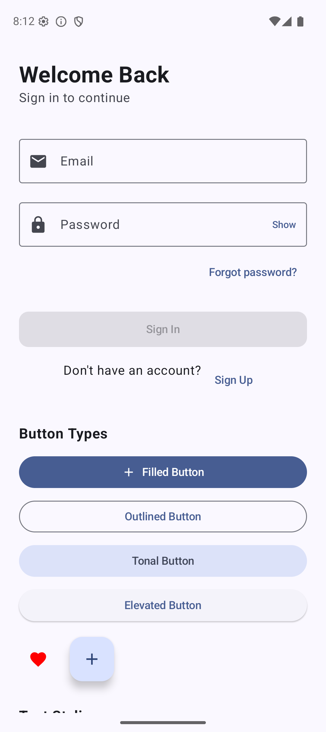 | 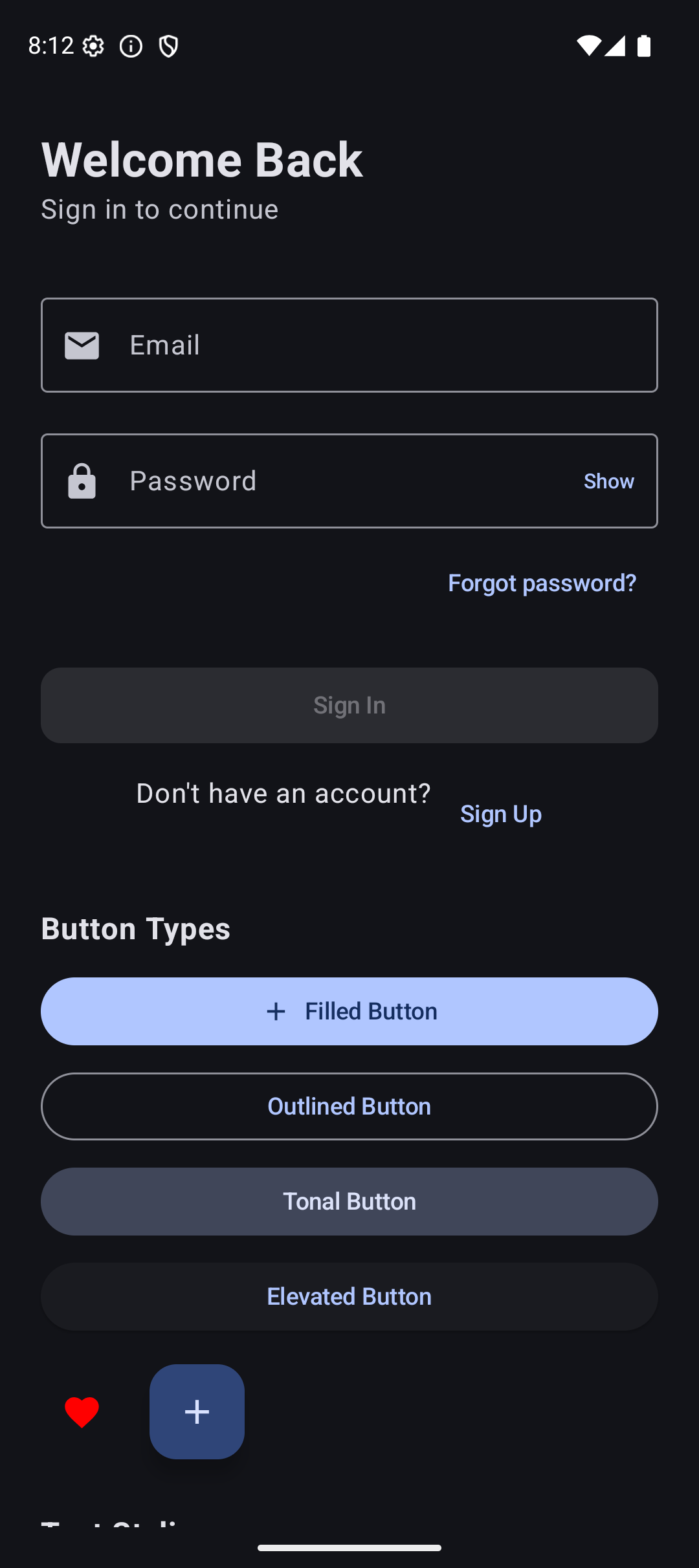 |
Source Code
The complete working code for this tutorial is on GitHub:
What’s Next?
In the next tutorial, we will learn about State — the most important concept in Jetpack Compose. How does the login button know to disable when fields are empty? How does the password toggle work? That is all state management, and understanding it is the key to building any real app.
See you there.
Related Articles
- Jetpack Compose Tutorial #3: Modifiers — learn how to style and position the components from this tutorial.
- Jetpack Compose Tutorial #5: State — make your components interactive with state management.