In the previous tutorial, we wrote our first Composable. But one Text on the screen is not an app. You need to put things next to each other, below each other, and on top of each other.
That is what layouts do.
Compose gives you three main layout components:
- Column — puts things vertically (top to bottom)
- Row — puts things horizontally (left to right)
- Box — puts things on top of each other (like layers)
Every screen you will ever build uses a combination of these three. Master them and you can build anything.
Column — Stack Things Vertically
Column places items from top to bottom. Think of it like a vertical list.
@Composable
fun VerticalExample() {
    Column {
        Text("First")
        Text("Second")
        Text("Third")
    }
}
This shows:
First
Second
Third
Simple. Items appear in the order you write them.
Adding Space Between Items
By default, items in a Column touch each other. You can add space with verticalArrangement:
@Composable
fun SpacedColumn() {
    Column(
        verticalArrangement = Arrangement.spacedBy(12.dp)
    ) {
        Text("First")
        Text("Second")
        Text("Third")
    }
}
Now there is 12dp of space between every item. Clean and consistent.
All Arrangement Options
verticalArrangement controls how items are spread inside the Column:
// Items at the top (default)
verticalArrangement = Arrangement.Top

// Items at the bottom
verticalArrangement = Arrangement.Bottom

// Items in the center
verticalArrangement = Arrangement.Center

// Equal space between items
verticalArrangement = Arrangement.SpaceBetween

// Equal space around items
verticalArrangement = Arrangement.SpaceAround

// Equal space everywhere
verticalArrangement = Arrangement.SpaceEvenly

// Fixed space between items
verticalArrangement = Arrangement.spacedBy(16.dp)
Let me show you the difference visually. Imagine a tall Column with three small items:
SpaceBetween:     SpaceAround:      SpaceEvenly:
┌──────────┐     ┌──────────┐      ┌──────────┐
│ Item 1   │     │          │      │          │
│          │     │ Item 1   │      │ Item 1   │
│          │     │          │      │          │
│ Item 2   │     │ Item 2   │      │ Item 2   │
│          │     │          │      │          │
│          │     │ Item 3   │      │ Item 3   │
│ Item 3   │     │          │      │          │
└──────────┘     └──────────┘      └──────────┘
- SpaceBetween — first item at top, last item at bottom, equal space in between
- SpaceAround — equal space around each item (edges get half space)
- SpaceEvenly — equal space everywhere, including edges
Horizontal Alignment in a Column
Items in a Column can also be aligned horizontally:
@Composable
fun AlignedColumn() {
    Column(
        modifier = Modifier.fillMaxWidth(),
        horizontalAlignment = Alignment.CenterHorizontally
    ) {
        Text("Centered")
        Text("Also Centered")
    }
}
All alignment options:
// Left side (default)
horizontalAlignment = Alignment.Start

// Center
horizontalAlignment = Alignment.CenterHorizontally

// Right side
horizontalAlignment = Alignment.End
Practical Example: A Settings Screen
Let’s build something real. A settings screen with sections:
@Composable
fun SettingsScreen() {
    Column(
        modifier = Modifier
            .fillMaxSize()
            .padding(16.dp),
        verticalArrangement = Arrangement.spacedBy(8.dp)
    ) {
        Text(
            text = "Settings",
            fontSize = 28.sp,
            fontWeight = FontWeight.Bold
        )

        Spacer(modifier = Modifier.height(8.dp))

        SettingsItem(title = "Notifications", subtitle = "Manage alerts and sounds")
        SettingsItem(title = "Appearance", subtitle = "Dark mode, font size, theme")
        SettingsItem(title = "Privacy", subtitle = "Permissions and data")
        SettingsItem(title = "Storage", subtitle = "Cache and downloads")
        SettingsItem(title = "About", subtitle = "Version and licenses")
    }
}

@Composable
fun SettingsItem(title: String, subtitle: String) {
    Column(
        modifier = Modifier
            .fillMaxWidth()
            .padding(vertical = 12.dp)
    ) {
        Text(
            text = title,
            fontSize = 18.sp,
            fontWeight = FontWeight.Medium
        )
        Text(
            text = subtitle,
            fontSize = 14.sp,
            color = MaterialTheme.colorScheme.onSurfaceVariant
        )
    }
}
Notice how SettingsScreen is a Column, and each SettingsItem is also a Column. You nest them. Small pieces build big screens.
Row — Stack Things Horizontally
Row places items from left to right. Same idea as Column, but sideways.
@Composable
fun HorizontalExample() {
    Row {
        Text("Left")
        Text("Center")
        Text("Right")
    }
}
This shows: Left Center Right — all on the same line.
Adding Space Between Items
Same pattern as Column, but we use horizontalArrangement:
@Composable
fun SpacedRow() {
    Row(
        horizontalArrangement = Arrangement.spacedBy(16.dp)
    ) {
        Text("Home")
        Text("Search")
        Text("Profile")
    }
}
All the same arrangement options work here: SpaceBetween, SpaceAround, SpaceEvenly, spacedBy().
Vertical Alignment in a Row
When items in a Row have different heights, you need to align them vertically:
@Composable
fun AlignedRow() {
    Row(
        verticalAlignment = Alignment.CenterVertically
    ) {
        Text("Small", fontSize = 14.sp)
        Text("Big", fontSize = 28.sp)
        Text("Small", fontSize = 14.sp)
    }
}
Options:
// Align to the top
verticalAlignment = Alignment.Top

// Center vertically
verticalAlignment = Alignment.CenterVertically

// Align to the bottom
verticalAlignment = Alignment.Bottom
Weight — Sharing Space
This is important. When you want items to share the available space, use weight():
@Composable
fun WeightExample() {
    Row(modifier = Modifier.fillMaxWidth()) {
        Text(
            text = "Left",
            modifier = Modifier.weight(1f)
        )
        Text(
            text = "Right",
            modifier = Modifier.weight(1f)
        )
    }
}
Both items get equal space (50% each) because both have weight(1f).
You can change the ratio:
Row(modifier = Modifier.fillMaxWidth()) {
    // Takes 2/3 of the space
    Text(
        text = "Main Content",
        modifier = Modifier.weight(2f)
    )
    // Takes 1/3 of the space
    Text(
        text = "Side",
        modifier = Modifier.weight(1f)
    )
}
weight(2f) gets twice as much space as weight(1f). The total weight is 3, so main content gets 2/3 and side gets 1/3.
Practical Example: A Message Bubble
Let’s build a chat message row:
@Composable
fun MessageRow(sender: String, message: String, time: String) {
    Row(
        modifier = Modifier
            .fillMaxWidth()
            .padding(horizontal = 16.dp, vertical = 8.dp),
        verticalAlignment = Alignment.Top
    ) {
        // Avatar circle
        Box(
            modifier = Modifier
                .size(40.dp)
                .background(
                    color = MaterialTheme.colorScheme.primaryContainer,
                    shape = CircleShape
                ),
            contentAlignment = Alignment.Center
        ) {
            Text(
                text = sender.first().toString(),
                fontWeight = FontWeight.Bold,
                color = MaterialTheme.colorScheme.onPrimaryContainer
            )
        }

        Spacer(modifier = Modifier.width(12.dp))

        // Message content - takes remaining space
        Column(modifier = Modifier.weight(1f)) {
            Text(
                text = sender,
                fontWeight = FontWeight.Bold,
                fontSize = 15.sp
            )
            Text(
                text = message,
                fontSize = 14.sp,
                color = MaterialTheme.colorScheme.onSurfaceVariant
            )
        }

        // Time - fixed width on the right
        Text(
            text = time,
            fontSize = 12.sp,
            color = MaterialTheme.colorScheme.outline
        )
    }
}
Use it:
Column {
    MessageRow("Alex", "Hey, did you see the new Compose update?", "10:30")
    MessageRow("Kemal", "Yes! Navigation 3 looks great.", "10:32")
    MessageRow("Alex", "We should try it in our project.", "10:33")
}
Look at the structure: a Row with an avatar (fixed size), message (weight takes remaining space), and time (fixed size). This is a very common pattern in real apps.
Box — Stack Things on Top of Each Other
Box places items on top of each other, like layers. The first item is at the bottom, the last item is on top.
@Composable
fun LayerExample() {
    Box {
        Text("Bottom Layer")
        Text("Top Layer")
    }
}
“Top Layer” will be drawn on top of “Bottom Layer”. They overlap.
When Do You Need Box?
Box is useful when you want to:
- Put text on top of an image
- Add a badge on top of an icon
- Create an overlay (like a loading indicator on top of content)
- Position one element in a specific corner
Content Alignment
contentAlignment controls where everything inside the Box goes:
@Composable
fun CenteredBox() {
    Box(
        modifier = Modifier.fillMaxSize(),
        contentAlignment = Alignment.Center
    ) {
        Text("I am in the center of the screen")
    }
}
All alignment options:
Alignment.TopStart        // Top-left
Alignment.TopCenter       // Top-center
Alignment.TopEnd          // Top-right
Alignment.CenterStart     // Middle-left
Alignment.Center          // Center
Alignment.CenterEnd       // Middle-right
Alignment.BottomStart     // Bottom-left
Alignment.BottomCenter    // Bottom-center
Alignment.BottomEnd       // Bottom-right
Individual Item Alignment
You can also align each item separately using the align modifier inside a Box:
@Composable
fun IndividualAlignment() {
    Box(modifier = Modifier.fillMaxSize()) {
        Text(
            text = "Top Left",
            modifier = Modifier.align(Alignment.TopStart)
        )
        Text(
            text = "Center",
            modifier = Modifier.align(Alignment.Center)
        )
        Text(
            text = "Bottom Right",
            modifier = Modifier.align(Alignment.BottomEnd)
        )
    }
}
Three items, each in a different position. Very useful for overlays and floating elements.
Practical Example: Image with Badge
A common pattern — showing a notification count on top of an icon:
@Composable
fun IconWithBadge(count: Int) {
    Box {
        // The icon
        Icon(
            imageVector = Icons.Default.Notifications,
            contentDescription = "Notifications",
            modifier = Modifier.size(32.dp)
        )

        // The badge (only show if count > 0)
        if (count > 0) {
            Box(
                modifier = Modifier
                    .align(Alignment.TopEnd)
                    .size(18.dp)
                    .background(Color.Red, CircleShape),
                contentAlignment = Alignment.Center
            ) {
                Text(
                    text = count.toString(),
                    color = Color.White,
                    fontSize = 10.sp,
                    fontWeight = FontWeight.Bold
                )
            }
        }
    }
}
The notification icon is the bottom layer. The red circle with the number sits on top, aligned to the top-right corner.
Practical Example: Loading Overlay
Another common pattern — showing a loading spinner on top of your content:
@Composable
fun ContentWithLoading(isLoading: Boolean) {
    Box(modifier = Modifier.fillMaxSize()) {
        // Your actual content (always there)
        Column(
            modifier = Modifier
                .fillMaxSize()
                .padding(16.dp)
        ) {
            Text("My App Content", fontSize = 24.sp)
            Text("Some data here...")
            Text("More data here...")
        }

        // Loading overlay (on top, only when loading)
        if (isLoading) {
            Box(
                modifier = Modifier
                    .fillMaxSize()
                    .background(Color.Black.copy(alpha = 0.3f)),
                contentAlignment = Alignment.Center
            ) {
                CircularProgressIndicator()
            }
        }
    }
}
The content is always rendered. When isLoading is true, a semi-transparent overlay with a spinner appears on top. When loading finishes, the overlay disappears. Clean and simple.
Combining All Three
Real screens use Column, Row, and Box together. The trick is knowing which one to use:
- Need things stacked vertically? → Column
- Need things side by side? → Row
- Need things on top of each other? → Box
Practical Example: A Product Card
Let’s build something that uses all three:
@Composable
fun ProductCard(
    name: String,
    price: String,
    rating: String,
    isNew: Boolean
) {
    // Box for the outer container (so we can put a badge on top)
    Box(
        modifier = Modifier
            .fillMaxWidth()
            .padding(8.dp)
    ) {
        // Column for the main content (vertical layout)
        Column(
            modifier = Modifier
                .fillMaxWidth()
                .background(
                    color = MaterialTheme.colorScheme.surface,
                    shape = RoundedCornerShape(12.dp)
                )
                .padding(16.dp)
        ) {
            // Product image placeholder
            Box(
                modifier = Modifier
                    .fillMaxWidth()
                    .height(150.dp)
                    .background(
                        color = MaterialTheme.colorScheme.surfaceVariant,
                        shape = RoundedCornerShape(8.dp)
                    ),
                contentAlignment = Alignment.Center
            ) {
                Text("Image", color = MaterialTheme.colorScheme.onSurfaceVariant)
            }

            Spacer(modifier = Modifier.height(12.dp))

            // Product name
            Text(
                text = name,
                fontSize = 18.sp,
                fontWeight = FontWeight.Bold
            )

            Spacer(modifier = Modifier.height(4.dp))

            // Row for price and rating (side by side)
            Row(
                modifier = Modifier.fillMaxWidth(),
                horizontalArrangement = Arrangement.SpaceBetween,
                verticalAlignment = Alignment.CenterVertically
            ) {
                Text(
                    text = price,
                    fontSize = 20.sp,
                    fontWeight = FontWeight.Bold,
                    color = MaterialTheme.colorScheme.primary
                )
                Text(
                    text = "⭐ $rating",
                    fontSize = 14.sp
                )
            }
        }

        // "NEW" badge on top-right corner
        if (isNew) {
            Box(
                modifier = Modifier
                    .align(Alignment.TopEnd)
                    .padding(top = 4.dp, end = 4.dp)
                    .background(
                        color = MaterialTheme.colorScheme.primary,
                        shape = RoundedCornerShape(4.dp)
                    )
                    .padding(horizontal = 8.dp, vertical = 4.dp)
            ) {
                Text(
                    text = "NEW",
                    color = MaterialTheme.colorScheme.onPrimary,
                    fontSize = 11.sp,
                    fontWeight = FontWeight.Bold
                )
            }
        }
    }
}
Use it:
Column(
    modifier = Modifier.padding(8.dp),
    verticalArrangement = Arrangement.spacedBy(8.dp)
) {
    ProductCard(
        name = "Wireless Headphones",
        price = "$49.99",
        rating = "4.5",
        isNew = true
    )
    ProductCard(
        name = "USB-C Cable",
        price = "$12.99",
        rating = "4.8",
        isNew = false
    )
}
Look at how all three work together:
- Box wraps everything so we can put the “NEW” badge on top
- Column arranges the image, name, and price section vertically
- Row puts the price and rating side by side
- Another Box creates the image placeholder and the badge
This is how real apps are built. Small layouts nested inside bigger layouts.
Spacer — The Invisible Helper
You already saw Spacer in some examples. It is a simple component that takes up space:
// Vertical space (use in a Column)
Spacer(modifier = Modifier.height(16.dp))

// Horizontal space (use in a Row)
Spacer(modifier = Modifier.width(16.dp))
You can also use Spacer with weight to push items apart:
Row(modifier = Modifier.fillMaxWidth()) {
    Text("Left")
    Spacer(modifier = Modifier.weight(1f))
    Text("Right")
}
The Spacer takes all remaining space, pushing “Left” to the left and “Right” to the right. Very useful for headers and toolbars.
Surface — A Container with Style
Surface is not a layout, but you will use it with layouts all the time. It gives you a background color, shape, elevation, and border — all in one:
@Composable
fun StyledCard() {
    Surface(
        modifier = Modifier
            .fillMaxWidth()
            .padding(16.dp),
        shape = RoundedCornerShape(12.dp),
        color = MaterialTheme.colorScheme.surface,
        shadowElevation = 4.dp
    ) {
        Column(modifier = Modifier.padding(16.dp)) {
            Text("Card Title", fontWeight = FontWeight.Bold)
            Text("Card content goes here")
        }
    }
}
Surface handles the visual container. Column handles the layout inside. Each component does one thing.
Common Mistakes
Mistake 1: Using Column for Long Lists
// BAD — if you have 100 items, all 100 are created at once
Column {
    items.forEach { item ->
        Text(item.name)
    }
}
If you have more than ~20 items, use LazyColumn instead. We will cover that in Tutorial #6.
Mistake 2: Forgetting fillMaxWidth
// This Row is only as wide as its content
Row {
    Text("Left")
    Spacer(modifier = Modifier.weight(1f))
    Text("Right")
}
This will crash. weight only works when the parent has a fixed size. Add fillMaxWidth:
// This Row takes the full screen width — weight works correctly
Row(modifier = Modifier.fillMaxWidth()) {
    Text("Left")
    Spacer(modifier = Modifier.weight(1f))
    Text("Right")
}
Mistake 3: Confusing Arrangement and Alignment
Here is the simple rule:
- Arrangement = direction the layout flows (main axis)
- Column →
verticalArrangement(controls top-to-bottom spacing) - Row →
horizontalArrangement(controls left-to-right spacing)
- Column →
- Alignment = the other direction (cross axis)
- Column →
horizontalAlignment(controls left-right position) - Row →
verticalAlignment(controls top-bottom position)
- Column →
Think of it this way: a Column goes down, so arrangement is vertical and alignment is horizontal. A Row goes right, so arrangement is horizontal and alignment is vertical.
Mistake 4: Deep Nesting
If your code looks like this, you need to refactor:
// BAD — too deep
Column {
    Row {
        Column {
            Row {
                Box {
                    Column {
                        Text("Lost somewhere...")
                    }
                }
            }
        }
    }
}
Extract pieces into separate Composable functions:
// GOOD — flat and readable
@Composable
fun MyScreen() {
    Column {
        Header()
        ContentSection()
        Footer()
    }
}

@Composable
fun Header() {
    Row { /* ... */ }
}

@Composable
fun ContentSection() {
    Column { /* ... */ }
}
Keep each Composable small. If a function is longer than 40-50 lines, break it into smaller pieces.
Quick Reference
| Layout | Direction | Arrangement | Alignment |
|---|---|---|---|
| Column | Top to bottom | verticalArrangement | horizontalAlignment |
| Row | Left to right | horizontalArrangement | verticalAlignment |
| Box | Layered (stacked) | — | contentAlignment |
| Component | Purpose |
|---|---|
| Spacer | Empty space between items |
| Surface | Styled container (background, shape, shadow) |
Quick Summary
- Column = vertical layout (like a stack of cards)
- Row = horizontal layout (like items on a shelf)
- Box = layered layout (like papers on a desk)
- Use Arrangement for spacing along the main direction
- Use Alignment for positioning on the other direction
- Use weight to share space proportionally
- Use Spacer to add empty space
- Keep nesting shallow — extract into separate Composables
Result
Here is what the app looks like when you run the code from this tutorial:
| Light Mode | Dark Mode |
|---|---|
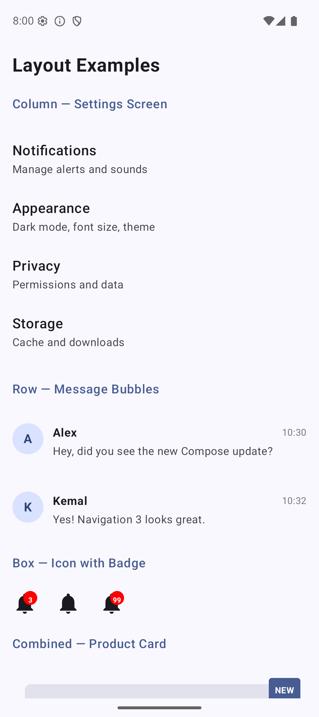 | 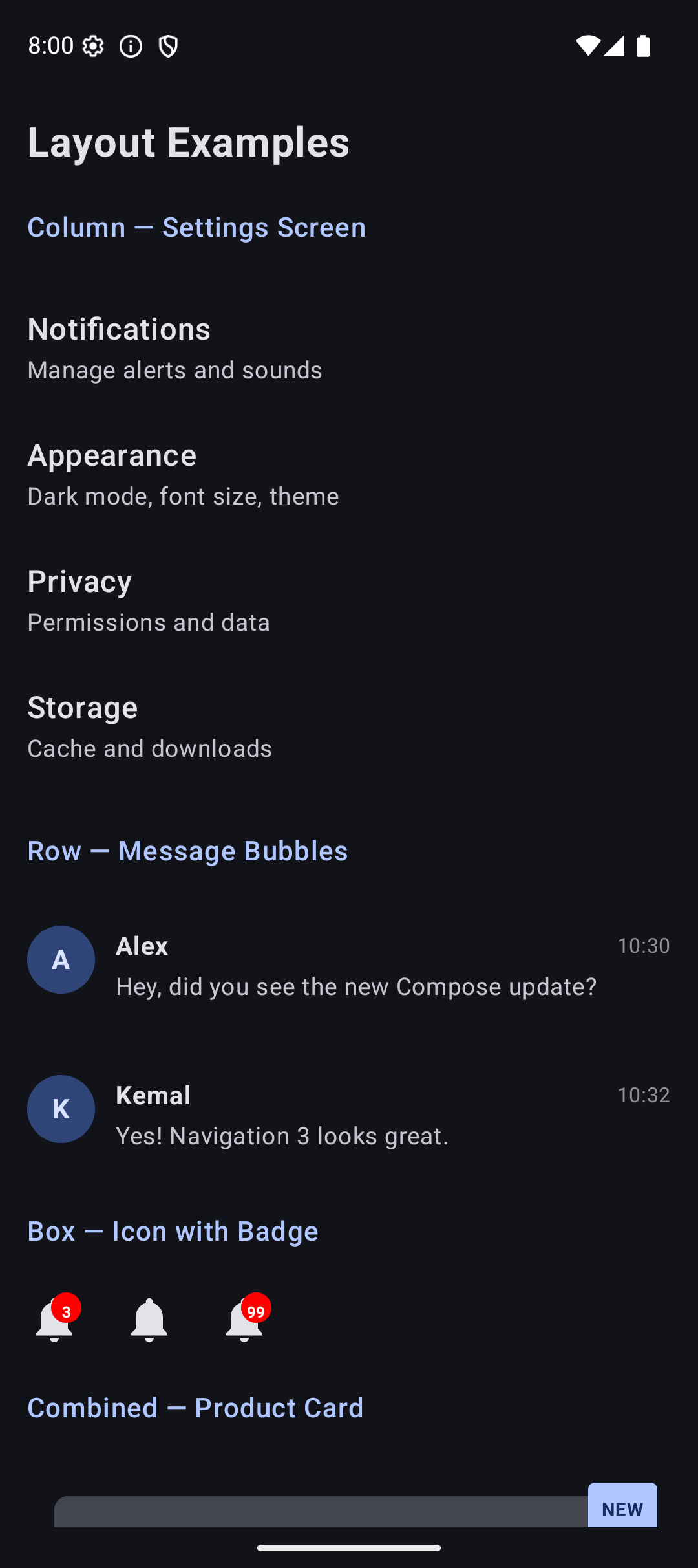 |
Source Code
The complete working code for this tutorial is on GitHub. Clone it and run it in Android Studio:
What’s Next?
In the next tutorial, we will learn about Modifiers — the system that controls size, padding, background, borders, click behavior, and everything else about how a Composable looks and behaves.
Modifiers are what make your layouts actually look good. See you there.