Every app has lists. A chat app has a list of messages. A store app has a list of products. A settings app has a list of options.
In the old Android world, you used RecyclerView — which needed an Adapter, a ViewHolder, a LayoutManager, and a lot of boilerplate code. In Compose, you just use LazyColumn. That’s it.
LazyColumn vs Column — Why Not Just Use Column?
You already know Column from Tutorial #2. Why not use it for lists?
// This works for 5 items
Column {
    Text("Item 1")
    Text("Item 2")
    Text("Item 3")
    Text("Item 4")
    Text("Item 5")
}
But what if you have 500 items? Column creates ALL 500 items at once, even the ones you can’t see. This is slow and wastes memory.
LazyColumn only creates the items that are visible on screen. When you scroll, it creates new items and destroys the ones that scrolled away. This is the same idea as RecyclerView, but much simpler to use.
Rule: Use Column for small, fixed lists (under 20 items). Use LazyColumn for anything bigger or dynamic.
LazyColumn — Vertical Scrolling List
Basic LazyColumn
@Composable
fun SimpleList() {
    LazyColumn {
        items(100) { index ->
            Text(
                text = "Item $index",
                modifier = Modifier.padding(16.dp)
            )
        }
    }
}
This creates a scrollable list with 100 items. Only the visible items exist in memory.
List from Data
Most of the time, you have a list of data objects:
data class Contact(val name: String, val email: String)

@Composable
fun ContactList(contacts: List<Contact>) {
    LazyColumn {
        items(contacts) { contact ->
            ContactRow(contact)
        }
    }
}
items vs itemsIndexed
Use items when you only need the data. Use itemsIndexed when you also need the position:
LazyColumn {
    // Just the item
    items(contacts) { contact ->
        Text(contact.name)
    }

    // Item + index
    itemsIndexed(contacts) { index, contact ->
        Text("${index + 1}. ${contact.name}")
    }
}
Adding Headers and Footers
You can mix single items and list items:
LazyColumn {
    // Header (single item)
    item {
        Text(
            "My Contacts",
            fontSize = 24.sp,
            fontWeight = FontWeight.Bold,
            modifier = Modifier.padding(16.dp)
        )
    }

    // List of contacts
    items(contacts) { contact ->
        ContactRow(contact)
    }

    // Footer (single item)
    item {
        Text(
            "${contacts.size} contacts",
            modifier = Modifier.padding(16.dp),
            color = Color.Gray
        )
    }
}
Sticky Headers
When you have a long list grouped by categories (contacts by letter, products by type), sticky headers help users know where they are while scrolling. The header stays at the top until the next group starts.
Note: stickyHeader may require @OptIn(ExperimentalFoundationApi::class) depending on your Compose version.
Group items with sticky headers:
LazyColumn {
    // Group contacts by first letter
    val grouped = contacts.groupBy { it.name.first() }

    grouped.forEach { (letter, contactsInGroup) ->
        stickyHeader {
            Text(
                text = letter.toString(),
                modifier = Modifier
                    .fillMaxWidth()
                    .background(MaterialTheme.colorScheme.surfaceVariant)
                    .padding(horizontal = 16.dp, vertical = 8.dp),
                fontWeight = FontWeight.Bold
            )
        }

        items(contactsInGroup) { contact ->
            ContactRow(contact)
        }
    }
}
Spacing Between Items
Two ways to add space between items:
// Option 1: verticalArrangement
LazyColumn(
    verticalArrangement = Arrangement.spacedBy(8.dp)
) {
    items(contacts) { contact ->
        ContactRow(contact)
    }
}

// Option 2: contentPadding (adds padding around the entire list)
LazyColumn(
    contentPadding = PaddingValues(16.dp),
    verticalArrangement = Arrangement.spacedBy(8.dp)
) {
    items(contacts) { contact ->
        ContactRow(contact)
    }
}
Use contentPadding instead of Modifier.padding() on the LazyColumn itself. This way, the padding scrolls with the content instead of cutting off items at the edges.
LazyRow — Horizontal Scrolling List
LazyRow works exactly like LazyColumn, but scrolls horizontally:
@Composable
fun CategoryChips(categories: List<String>) {
    LazyRow(
        horizontalArrangement = Arrangement.spacedBy(8.dp),
        contentPadding = PaddingValues(horizontal = 16.dp)
    ) {
        items(categories) { category ->
            FilterChip(category)
        }
    }
}

@Composable
fun FilterChip(label: String) {
    Text(
        text = label,
        modifier = Modifier
            .clip(RoundedCornerShape(50))
            .background(MaterialTheme.colorScheme.secondaryContainer)
            .padding(horizontal = 16.dp, vertical = 8.dp),
        color = MaterialTheme.colorScheme.onSecondaryContainer
    )
}
Common uses for LazyRow:
- Category filters at the top of a screen
- Horizontal image galleries
- Story/status bars (like Instagram)
- Product recommendations
LazyVerticalGrid — Grid Layout
For grid layouts (like a photo gallery or product grid):
@Composable
fun PhotoGrid(photos: List<String>) {
    LazyVerticalGrid(
        columns = GridCells.Fixed(2), // 2 columns
        contentPadding = PaddingValues(8.dp),
        verticalArrangement = Arrangement.spacedBy(8.dp),
        horizontalArrangement = Arrangement.spacedBy(8.dp)
    ) {
        items(photos) { photo ->
            PhotoCard(photo)
        }
    }
}
Grid Column Options
// Fixed number of columns
columns = GridCells.Fixed(2)     // Always 2 columns
columns = GridCells.Fixed(3)     // Always 3 columns

// Adaptive — adjusts based on screen width
columns = GridCells.Adaptive(150.dp) // Each column is at least 150dp wide
GridCells.Adaptive is great for supporting different screen sizes. On a phone you might get 2 columns, on a tablet you get 4.
Click Handling in Lists
Simple Click
LazyColumn {
    items(contacts) { contact ->
        ContactRow(
            contact = contact,
            onClick = { println("Clicked: ${contact.name}") }
        )
    }
}

@Composable
fun ContactRow(contact: Contact, onClick: () -> Unit) {
    Row(
        modifier = Modifier
            .fillMaxWidth()
            .clickable { onClick() }
            .padding(16.dp),
        verticalAlignment = Alignment.CenterVertically
    ) {
        // Avatar
        Box(
            modifier = Modifier
                .size(40.dp)
                .clip(CircleShape)
                .background(MaterialTheme.colorScheme.primaryContainer),
            contentAlignment = Alignment.Center
        ) {
            Text(
                text = contact.name.firstOrNull()?.toString() ?: "?",
                fontWeight = FontWeight.Bold
            )
        }

        Spacer(modifier = Modifier.width(12.dp))

        // Info
        Column {
            Text(contact.name, fontWeight = FontWeight.Medium)
            Text(contact.email, fontSize = 14.sp, color = Color.Gray)
        }
    }
}
Selectable List
@Composable
fun SelectableList(items: List<String>) {
    var selectedIndex by remember { mutableStateOf(-1) }

    LazyColumn {
        itemsIndexed(items) { index, item ->
            Row(
                modifier = Modifier
                    .fillMaxWidth()
                    .background(
                        if (index == selectedIndex)
                            MaterialTheme.colorScheme.primaryContainer
                        else
                            Color.Transparent
                    )
                    .clickable { selectedIndex = index }
                    .padding(16.dp)
            ) {
                Text(item)
            }
        }
    }
}
Performance: Using Keys
By default, Compose identifies list items by their position. If you add or remove items, Compose might redraw more than necessary.
Use key to tell Compose how to identify each item:
LazyColumn {
    items(
        items = contacts,
        key = { contact -> contact.id }  // Unique identifier
    ) { contact ->
        ContactRow(contact)
    }
}
With keys, when you add an item at the top of the list, Compose knows the existing items didn’t change — it only creates the new one. Without keys, it might redraw the entire list.
Always use keys when:
- Items can be added, removed, or reordered
- Items have a unique ID (like a database ID)
Tip: You can also use Modifier.animateItem() to animate items when they are added, removed, or reordered in the list.
Note: The items() function also accepts a contentType parameter. When your list has different types of items (headers, cards, footers), setting contentType helps Compose reuse compositions more efficiently.
Practical Example: Contact List App
Let’s build a complete contact list screen with all the features:
data class Contact(
    val id: Int,
    val name: String,
    val email: String,
    val isOnline: Boolean
)

@Composable
fun ContactListScreen() {
    val contacts = remember {
        listOf(
            Contact(1, "Alex", "alex@example.com", true),
            Contact(2, "Sam", "sam@example.com", false),
            Contact(3, "Jordan", "jordan@example.com", true),
            Contact(4, "Taylor", "taylor@example.com", false),
            Contact(5, "Morgan", "morgan@example.com", true),
            Contact(6, "Casey", "casey@example.com", false),
            Contact(7, "Riley", "riley@example.com", true),
            Contact(8, "Quinn", "quinn@example.com", true),
        )
    }

    var selectedId by remember { mutableStateOf(-1) }

    Column(modifier = Modifier.fillMaxSize()) {
        // Header
        Text(
            text = "Contacts",
            fontSize = 24.sp,
            fontWeight = FontWeight.Bold,
            modifier = Modifier.padding(16.dp)
        )

        // Category filter (horizontal list)
        LazyRow(
            horizontalArrangement = Arrangement.spacedBy(8.dp),
            contentPadding = PaddingValues(horizontal = 16.dp)
        ) {
            val filters = listOf("All", "Online", "Offline")
            items(filters) { filter ->
                FilterChip(filter)
            }
        }

        Spacer(modifier = Modifier.height(8.dp))

        // Contact list (vertical list)
        LazyColumn(
            verticalArrangement = Arrangement.spacedBy(2.dp),
            contentPadding = PaddingValues(horizontal = 16.dp)
        ) {
            items(
                items = contacts,
                key = { it.id }  // Use ID as key for better performance
            ) { contact ->
                ContactCard(
                    contact = contact,
                    isSelected = contact.id == selectedId,
                    onClick = { selectedId = contact.id }
                )
            }

            // Footer
            item {
                Text(
                    text = "${contacts.size} contacts",
                    modifier = Modifier.padding(vertical = 16.dp),
                    color = Color.Gray,
                    fontSize = 14.sp
                )
            }
        }
    }
}

@Composable
fun ContactCard(
    contact: Contact,
    isSelected: Boolean,
    onClick: () -> Unit
) {
    Row(
        modifier = Modifier
            .fillMaxWidth()
            .background(
                if (isSelected) MaterialTheme.colorScheme.primaryContainer
                else Color.Transparent,
                RoundedCornerShape(8.dp)
            )
            .clickable { onClick() }
            .padding(12.dp),
        verticalAlignment = Alignment.CenterVertically
    ) {
        // Avatar with online status
        Box {
            Box(
                modifier = Modifier
                    .size(44.dp)
                    .clip(CircleShape)
                    .background(MaterialTheme.colorScheme.secondaryContainer),
                contentAlignment = Alignment.Center
            ) {
                Text(
                    text = contact.name.firstOrNull()?.toString() ?: "?",
                    fontWeight = FontWeight.Bold
                )
            }
            if (contact.isOnline) {
                Box(
                    modifier = Modifier
                        .size(12.dp)
                        .align(Alignment.BottomEnd)
                        .background(Color(0xFF4CAF50), CircleShape)
                        .border(2.dp, MaterialTheme.colorScheme.surface, CircleShape)
                )
            }
        }

        Spacer(modifier = Modifier.width(12.dp))

        Column(modifier = Modifier.weight(1f)) {
            Text(contact.name, fontWeight = FontWeight.Medium)
            Text(
                contact.email,
                fontSize = 14.sp,
                color = MaterialTheme.colorScheme.onSurfaceVariant
            )
        }
    }
}
This contact list has:
- A header at the top
- Horizontal filter chips (LazyRow)
- Vertical contact list (LazyColumn) with keys
- Click to select (highlighted background)
- Online status dots
- Footer showing total count
Common Mistakes
Mistake 1: Using Column for Long Lists
// BAD — creates all 1000 items at once
Column(modifier = Modifier.verticalScroll(rememberScrollState())) {
    repeat(1000) { Text("Item $it") }
}

// GOOD — only creates visible items
LazyColumn {
    items(1000) { Text("Item $it") }
}
Mistake 2: Nesting LazyColumn Inside LazyColumn
// BAD — crashes or behaves unpredictably
LazyColumn {
    item {
        LazyColumn { /* ... */ } // Never do this!
    }
}
If you need nested scrolling, use a regular Column for the inner list, or flatten the data into a single LazyColumn with headers.
Mistake 3: Using Modifier.padding on LazyColumn
// BAD — items get cut off at the edges
LazyColumn(modifier = Modifier.padding(16.dp)) {
    items(data) { /* ... */ }
}

// GOOD — padding scrolls with content
LazyColumn(contentPadding = PaddingValues(16.dp)) {
    items(data) { /* ... */ }
}
Mistake 4: Forgetting Keys for Dynamic Lists
// BAD — no keys, Compose redraws everything when list changes
items(contacts) { contact -> ContactRow(contact) }

// GOOD — keys help Compose track individual items
items(items = contacts, key = { it.id }) { contact -> ContactRow(contact) }
Quick Reference
| Component | Direction | Use For |
|---|---|---|
LazyColumn | Vertical | Long scrollable lists |
LazyRow | Horizontal | Category chips, galleries |
LazyVerticalGrid | Grid | Photo grids, product grids |
Column + verticalScroll | Vertical | Short, fixed content |
| Function | What It Does |
|---|---|
items(list) | Add items from a list |
items(count) | Add a number of items |
itemsIndexed(list) | Add items with index |
item { } | Add a single item (header/footer) |
stickyHeader { } | Header that sticks while scrolling |
Result
Here is what the app looks like when you run the code from this tutorial:
| Light Mode | Dark Mode |
|---|---|
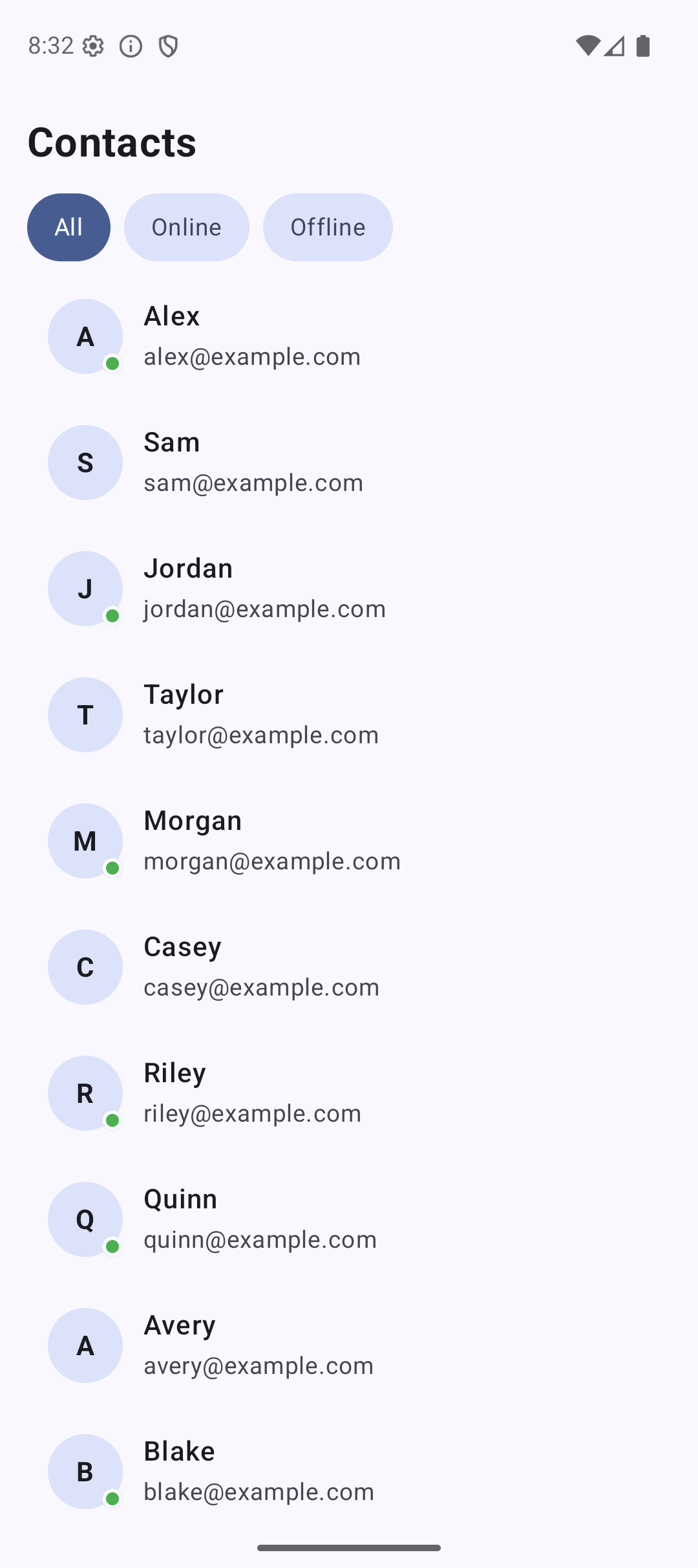 | 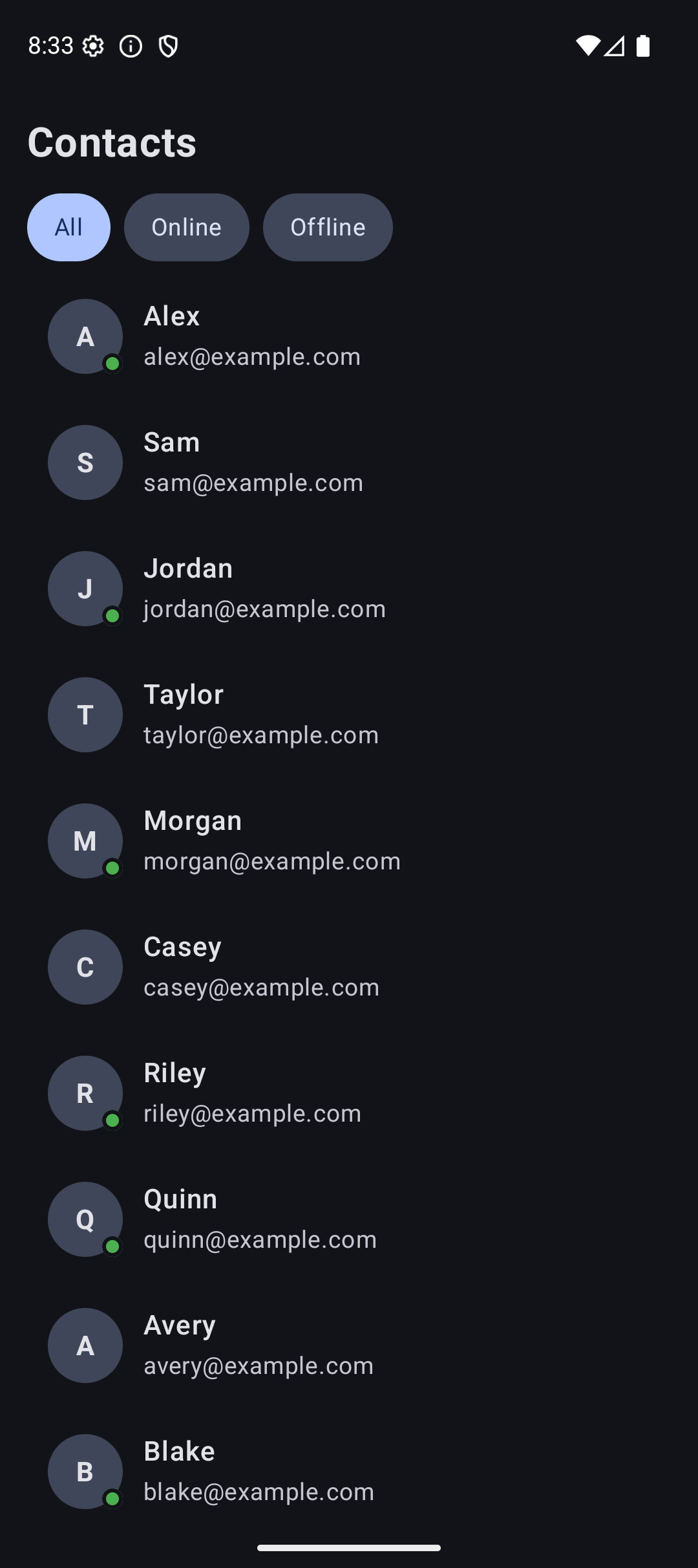 |
Source Code
The complete working code for this tutorial is on GitHub:
Related Tutorials
- Tutorial #5: State — state management that powers list interactions
- Tutorial #2: Layouts — Column and Row basics before LazyColumn
- Jetpack Compose Cheat Sheet — quick reference for every component and modifier.
- Full Series: Jetpack Compose Tutorial — all 25 tutorials from zero to publishing.
What’s Next?
In the next tutorial, we will learn about Material 3 Theming — custom colors, typography, dark mode, and dynamic colors. This is what makes your app look professional.
See you there.