In the previous tutorial, we learned how to arrange things on screen with Column, Row, and Box. But everything looked plain. No padding. No colors. No borders.
That is where Modifiers come in.
Modifiers are how you control everything about how a Composable looks and behaves — size, spacing, color, shape, click behavior, scrolling, and more.
If layouts are the skeleton, modifiers are the skin and muscles.
What is a Modifier?
A Modifier is a chain of instructions that you attach to a Composable. Each instruction changes one thing about how it looks or acts.
Text(
    text = "Hello",
    modifier = Modifier
        .padding(16.dp)
        .background(Color.Blue)
        .fillMaxWidth()
)
This text now has padding, a blue background, and takes the full width. Three modifiers, chained together.
The Basic Pattern
Almost every Composable accepts a modifier parameter:
Text(text = "Hello", modifier = Modifier.padding(8.dp))
Button(onClick = {}, modifier = Modifier.fillMaxWidth()) { Text("Click") }
Column(modifier = Modifier.fillMaxSize().padding(16.dp)) { }
Box(modifier = Modifier.size(100.dp).background(Color.Red)) { }
You always start with Modifier (capital M) and then chain methods with dots.
Size Modifiers
fillMaxSize, fillMaxWidth, fillMaxHeight
These make a Composable take all available space:
// Takes the entire screen
Box(modifier = Modifier.fillMaxSize()) { }

// Takes full width but only the height it needs
Column(modifier = Modifier.fillMaxWidth()) { }

// Takes full height but only the width it needs
Row(modifier = Modifier.fillMaxHeight()) { }
You can also pass a fraction:
// Takes 50% of the width
Box(modifier = Modifier.fillMaxWidth(0.5f))

// Takes 80% of the height
Box(modifier = Modifier.fillMaxHeight(0.8f))
size, width, height
Set exact dimensions:
// Square box, 100dp x 100dp
Box(modifier = Modifier.size(100.dp))

// Rectangle, 200dp wide x 100dp tall
Box(modifier = Modifier.size(width = 200.dp, height = 100.dp))

// Only set width (height wraps content)
Text("Hello", modifier = Modifier.width(200.dp))

// Only set height
Text("Hello", modifier = Modifier.height(50.dp))
requiredSize
size is a suggestion. If the parent is smaller, the Composable will shrink. requiredSize forces the exact size, even if it overflows:
// Always 200dp, even if the parent is only 100dp wide
Box(modifier = Modifier.requiredSize(200.dp))
Use requiredSize only when you really need an exact size. Most of the time, size is enough.
wrapContentSize
Makes the Composable only take the space it needs:
Box(
    modifier = Modifier.fillMaxSize(),
    contentAlignment = Alignment.Center
) {
    Text(
        "I am small",
        modifier = Modifier.wrapContentSize()
    )
}
Spacing Modifiers
padding
Padding adds space inside the Composable, between its edge and its content.
// Same padding on all 4 sides
Text("Hello", modifier = Modifier.padding(16.dp))

// Different horizontal and vertical padding
Text("Hello", modifier = Modifier.padding(horizontal = 24.dp, vertical = 8.dp))

// Different padding on each side
Text("Hello", modifier = Modifier.padding(
    start = 16.dp,
    top = 8.dp,
    end = 16.dp,
    bottom = 24.dp
))
Important: Compose does not have a “margin” modifier. To add space outside a Composable, add padding to the parent or use Spacer.
offset
Moves a Composable from its normal position without affecting other elements:
Text(
    "Shifted",
    modifier = Modifier.offset(x = 10.dp, y = 5.dp)
)
The text moves 10dp right and 5dp down, but other elements still act like it is in its original position. Use offset for small visual adjustments, not for layout.
Appearance Modifiers
background
Sets the background color:
Text(
    "Hello",
    modifier = Modifier
        .background(Color.Blue)
        .padding(16.dp)
)
With a shape:
Text(
    "Rounded",
    modifier = Modifier
        .background(
            color = MaterialTheme.colorScheme.primaryContainer,
            shape = RoundedCornerShape(8.dp)
        )
        .padding(horizontal = 16.dp, vertical = 8.dp)
)
clip
Clips the Composable to a shape. Anything outside the shape is hidden:
// Circle image
Image(
    painter = painterResource(R.drawable.photo),
    contentDescription = "Profile",
    modifier = Modifier
        .size(80.dp)
        .clip(CircleShape)
)

// Rounded corners
Box(
    modifier = Modifier
        .size(200.dp, 150.dp)
        .clip(RoundedCornerShape(16.dp))
        .background(Color.Blue)
)
border
Adds a border around the Composable:
// Simple border
Text(
    "Bordered",
    modifier = Modifier
        .border(2.dp, Color.Gray, RoundedCornerShape(8.dp))
        .padding(16.dp)
)

// Rounded border
Box(
    modifier = Modifier
        .size(100.dp)
        .border(
            width = 2.dp,
            color = MaterialTheme.colorScheme.primary,
            shape = CircleShape
        )
)
shadow
Adds a shadow (elevation effect):
Box(
    modifier = Modifier
        .size(200.dp)
        .shadow(
            elevation = 8.dp,
            shape = RoundedCornerShape(12.dp)
        )
        .background(MaterialTheme.colorScheme.surface)
)
alpha
Makes a Composable semi-transparent:
// 50% transparent
Text("Faded", modifier = Modifier.alpha(0.5f))
Interaction Modifiers
clickable
Makes any Composable tappable:
Box(
    modifier = Modifier
        .size(100.dp)
        .background(Color.Blue, RoundedCornerShape(8.dp))
        .clickable {
            // This runs when the user taps
            println("Tapped!")
        }
)
This adds a ripple effect automatically. To remove the ripple:
.clickable(
    indication = null,
    interactionSource = remember { MutableInteractionSource() }
) {
    // No ripple
}
verticalScroll, horizontalScroll
Makes content scrollable:
Column(
    modifier = Modifier
        .fillMaxSize()
        .verticalScroll(rememberScrollState())
) {
    // This Column is now scrollable
    repeat(50) {
        Text("Item $it", modifier = Modifier.padding(16.dp))
    }
}
Note: Don’t use this for long lists. Use LazyColumn instead (Tutorial #6). Use scroll modifiers only when you have a fixed amount of content that might overflow.
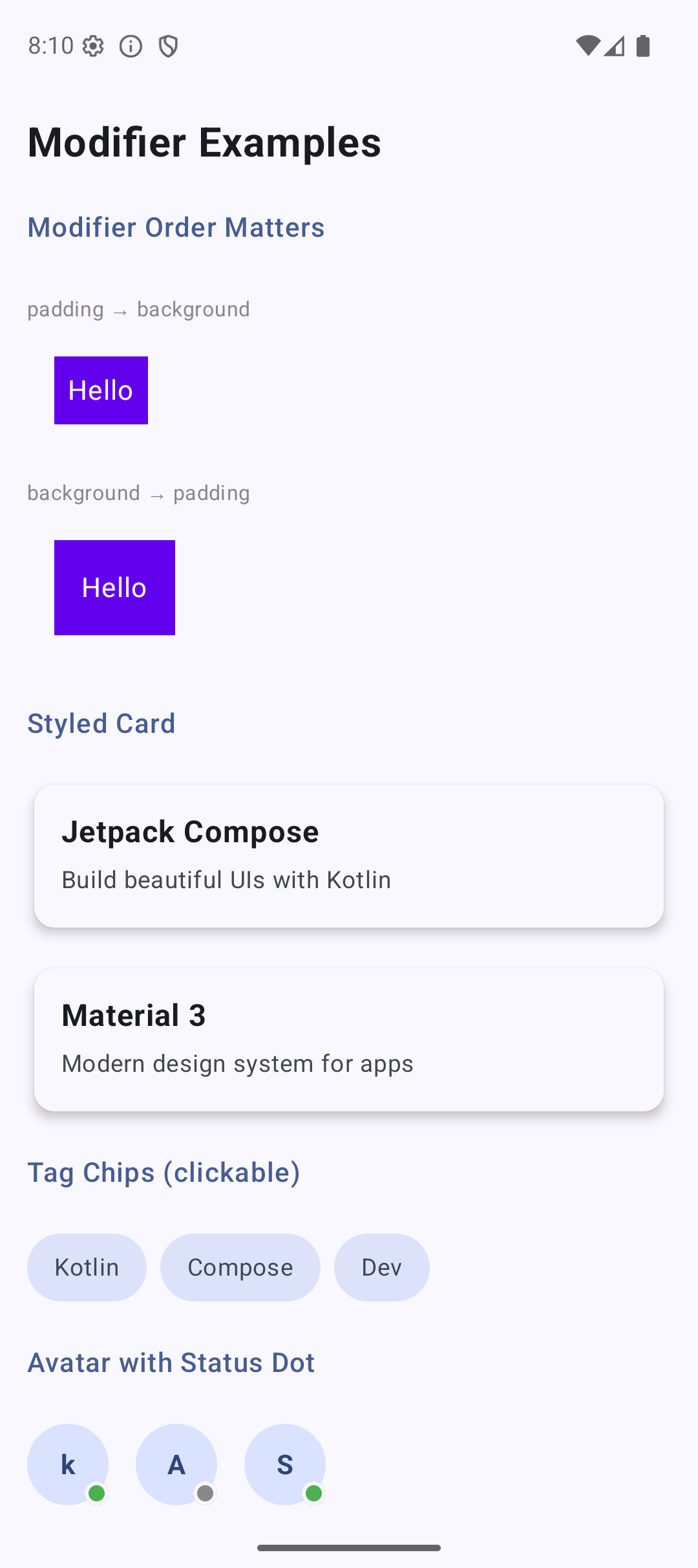
Why Modifier Order Matters
This is the most common mistake in Compose. The order of modifiers changes the result.
Look at these two examples:
Example 1: Padding THEN Background
Text(
    "Hello",
    modifier = Modifier
        .padding(16.dp)        // 1. Add space around
        .background(Color.Blue) // 2. Then color the remaining area
)
Result: blue background with NO padding visible. The padding is outside the blue area.
Example 2: Background THEN Padding
Text(
    "Hello",
    modifier = Modifier
        .background(Color.Blue) // 1. Color the whole area
        .padding(16.dp)         // 2. Then add space inside
)
Result: blue background WITH padding. The text has breathing room inside the blue box.
The Rule
Think of modifiers as layers applied from outside to inside:
Modifier
    .padding(8.dp)           // Layer 1: outer space
    .background(Color.Blue)   // Layer 2: blue background
    .padding(16.dp)           // Layer 3: inner space
This creates: 8dp outer space → blue background → 16dp inner space → text.
Yes, you can use padding twice. The first padding acts like a margin (space outside the background). The second padding adds space inside.
Visual Guide
┌─────────────────────────────────────┐
│ padding(8.dp) — outer space         │
│  ┌──────────────────────────────┐   │
│  │ background(Color.Blue)       │   │
│  │  ┌───────────────────────┐   │   │
│  │  │ padding(16.dp) — inner│   │   │
│  │  │                       │   │   │
│  │  │   Text("Hello")       │   │   │
│  │  │                       │   │   │
│  │  └───────────────────────┘   │   │
│  └──────────────────────────────┘   │
└─────────────────────────────────────┘
Practical Examples
Styled Card
@Composable
fun StyledCard(title: String, subtitle: String) {
    Column(
        modifier = Modifier
            .fillMaxWidth()
            .padding(horizontal = 16.dp, vertical = 8.dp)
            .shadow(4.dp, RoundedCornerShape(12.dp))
            .background(
                MaterialTheme.colorScheme.surface,
                RoundedCornerShape(12.dp)
            )
            .padding(16.dp)
    ) {
        Text(
            text = title,
            fontSize = 18.sp,
            fontWeight = FontWeight.Bold
        )
        Spacer(modifier = Modifier.height(4.dp))
        Text(
            text = subtitle,
            fontSize = 14.sp,
            color = MaterialTheme.colorScheme.onSurfaceVariant
        )
    }
}
Look at the modifier chain:
fillMaxWidth— take full widthpadding(horizontal, vertical)— outer spacing (like margin)shadow— drop shadowbackgroundwith rounded corners — card surfacepadding(16.dp)— inner spacing for content
Clickable Tag Chip
@Composable
fun TagChip(label: String, onClick: () -> Unit) {
    Text(
        text = label,
        modifier = Modifier
            .clip(RoundedCornerShape(50))
            .background(MaterialTheme.colorScheme.secondaryContainer)
            .clickable { onClick() }
            .padding(horizontal = 16.dp, vertical = 8.dp),
        color = MaterialTheme.colorScheme.onSecondaryContainer,
        fontSize = 14.sp
    )
}
Usage:
Row(horizontalArrangement = Arrangement.spacedBy(8.dp)) {
    TagChip("Kotlin") { }
    TagChip("Compose") { }
    TagChip("Android") { }
}
Avatar with Status Dot
@Composable
fun AvatarWithStatus(name: String, isOnline: Boolean) {
    Box {
        // Avatar circle
        Box(
            modifier = Modifier
                .size(48.dp)
                .clip(CircleShape)
                .background(MaterialTheme.colorScheme.primaryContainer),
            contentAlignment = Alignment.Center
        ) {
            Text(
                text = name.firstOrNull()?.toString() ?: "?",
                fontWeight = FontWeight.Bold,
                color = MaterialTheme.colorScheme.onPrimaryContainer
            )
        }

        // Status dot
        Box(
            modifier = Modifier
                .size(14.dp)
                .align(Alignment.BottomEnd)
                .border(2.dp, MaterialTheme.colorScheme.surface, CircleShape)
                .background(
                    if (isOnline) Color(0xFF4CAF50) else Color.Gray,
                    CircleShape
                )
        )
    }
}
Full-Width Button with Icon
@Composable
fun PrimaryButton(text: String, onClick: () -> Unit) {
    Row(
        modifier = Modifier
            .fillMaxWidth()
            .clip(RoundedCornerShape(12.dp))
            .background(MaterialTheme.colorScheme.primary)
            .clickable { onClick() }
            .padding(16.dp),
        horizontalArrangement = Arrangement.Center,
        verticalAlignment = Alignment.CenterVertically
    ) {
        Text(
            text = text,
            color = MaterialTheme.colorScheme.onPrimary,
            fontWeight = FontWeight.Bold
        )
    }
}
Creating Reusable Modifiers
If you use the same modifier chain in many places, save it as a variable:
// Define once
val cardModifier = Modifier
    .fillMaxWidth()
    .shadow(4.dp, RoundedCornerShape(12.dp))
    .background(Color.White, RoundedCornerShape(12.dp))
    .padding(16.dp)

// Use everywhere
Column(modifier = cardModifier) {
    Text("Card 1")
}

Column(modifier = cardModifier) {
    Text("Card 2")
}
You can also create extension functions for custom modifiers:
fun Modifier.card(): Modifier = this
    .fillMaxWidth()
    .shadow(4.dp, RoundedCornerShape(12.dp))
    .background(Color.White, RoundedCornerShape(12.dp))
    .padding(16.dp)

// Usage
Column(modifier = Modifier.card()) {
    Text("Clean and reusable")
}
Common Mistakes
Mistake 1: Wrong Modifier Order
// Wrong — padding is outside the background
Modifier.padding(16.dp).background(Color.Blue)

// Right — padding is inside the background
Modifier.background(Color.Blue).padding(16.dp)
Mistake 2: Clickable Before Clip
// Wrong — ripple effect extends outside the rounded shape
Modifier.clickable { }.clip(RoundedCornerShape(8.dp))

// Right — ripple is clipped to the shape
Modifier.clip(RoundedCornerShape(8.dp)).clickable { }
Mistake 3: Forgetting fillMaxWidth
// This button is only as wide as its text
Button(onClick = {}) { Text("Submit") }

// This button takes full width
Button(
    onClick = {},
    modifier = Modifier.fillMaxWidth()
) { Text("Submit") }
Mistake 4: Using Fixed Sizes Everywhere
// Bad — breaks on different screen sizes
Box(modifier = Modifier.size(360.dp))

// Good — adapts to screen
Box(modifier = Modifier.fillMaxWidth().padding(16.dp))
Use fillMaxWidth and padding instead of fixed pixel sizes. Your app needs to work on phones, tablets, and foldables.
Quick Reference
Size
| Modifier | What It Does |
|---|---|
fillMaxSize() | Takes all available space |
fillMaxWidth() | Takes full width |
fillMaxHeight() | Takes full height |
size(100.dp) | Fixed size |
width(200.dp) | Fixed width |
height(50.dp) | Fixed height |
wrapContentSize() | Only as big as content |
Spacing
| Modifier | What It Does |
|---|---|
padding(16.dp) | Space inside (all sides) |
padding(horizontal = X, vertical = Y) | Different horizontal/vertical |
offset(x = 10.dp, y = 5.dp) | Move without affecting layout |
Appearance
| Modifier | What It Does |
|---|---|
background(color) | Background color |
background(color, shape) | Background with shape |
clip(shape) | Clip to shape |
border(width, color, shape) | Border |
shadow(elevation, shape) | Drop shadow |
alpha(0.5f) | Transparency |
Interaction
| Modifier | What It Does |
|---|---|
clickable { } | Make tappable |
verticalScroll(state) | Vertical scroll |
horizontalScroll(state) | Horizontal scroll |
Result
Here is what the app looks like when you run the code from this tutorial:
| Light Mode | Dark Mode |
|---|---|
 | 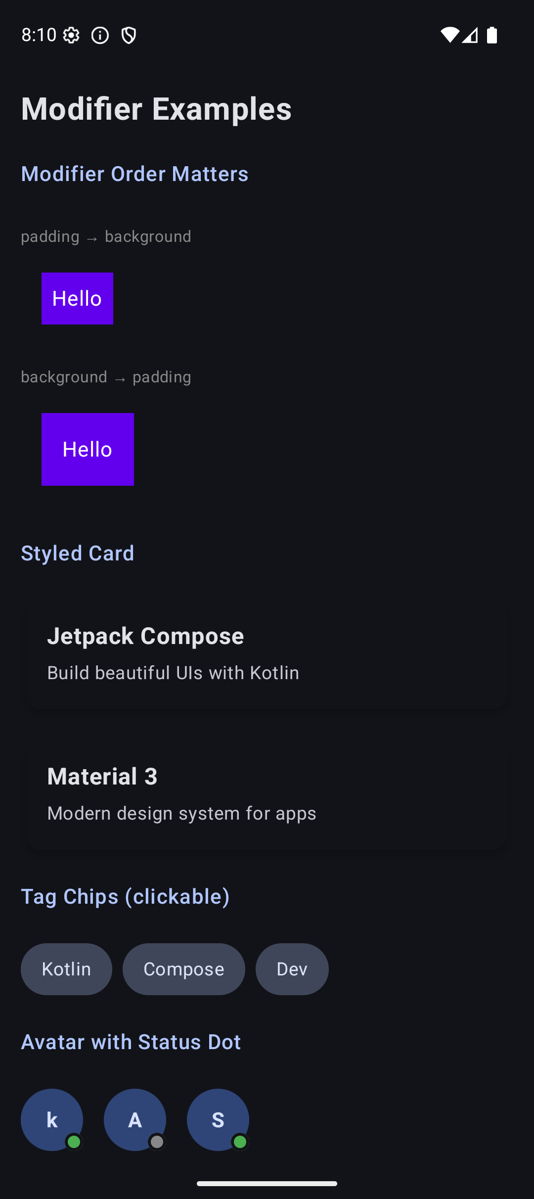 |
Source Code
The complete working code for this tutorial is on GitHub:
What’s Next?
In the next tutorial, we will learn about the core UI components — Text, Button, Image, and TextField. You already used some of these, but there is a lot more to them. Custom fonts, button styles, image loading, form handling — all coming up.
See you there.
Related Articles
- Jetpack Compose Tutorial #2: Layouts — review how Column, Row, and Box work before diving into components.
- Jetpack Compose Tutorial #4: Components — the next tutorial: Text, Button, Image, and TextField in depth.