Your app works. But it looks like every other default Compose app — same purple, same fonts, same everything.
Theming is how you make your app look like YOUR app. Custom colors, custom fonts, dark mode support — all in one system that applies everywhere automatically.
Material 3 (also called Material You) is the design system Google built for modern Android apps. Compose uses it by default. In this tutorial, you will learn how to customize it.
What is Material 3?
Material 3 is a set of design rules that defines how your app looks:
- Colors — which colors to use for buttons, backgrounds, text, etc.
- Typography — which fonts and sizes to use
- Shapes — how rounded corners should be
When you write MaterialTheme.colorScheme.primary, you are asking the theme: “What is the primary color right now?” The theme answers differently in light mode vs dark mode. Your UI code stays the same.
How Material 3 Theming Works in Jetpack Compose
Every Compose app already has a theme. When you created your project, Android Studio generated a Theme.kt file in the ui/theme/ folder.
The structure looks like this:
ui/theme/
├── Color.kt      — your color definitions
├── Theme.kt      — the theme that combines everything
└── Type.kt       — your typography (font) definitions
The theme wraps your entire app:
// In MainActivity.kt
setContent {
    MyAppTheme {  // Theme wraps everything
        // All Composables inside use this theme
        MyScreen()
    }
}
Every Composable inside the theme can access colors, fonts, and shapes through MaterialTheme.
Custom Colors
Defining Your Color Palette
Open Color.kt and define your colors:
// Color.kt
import androidx.compose.ui.graphics.Color

// Light theme colors
val Blue40 = Color(0xFF1565C0)
val BlueGrey40 = Color(0xFF546E7A)
val Teal40 = Color(0xFF00897B)

// Dark theme colors
val Blue80 = Color(0xFF90CAF9)
val BlueGrey80 = Color(0xFFB0BEC5)
val Teal80 = Color(0xFF80CBC4)

// Additional colors
val SurfaceLight = Color(0xFFF8F9FA)
val SurfaceDark = Color(0xFF1A1A2E)
val ErrorRed = Color(0xFFCF6679)
Building Color Schemes
In Theme.kt, create light and dark color schemes:
private val LightColorScheme = lightColorScheme(
    primary = Blue40,
    secondary = BlueGrey40,
    tertiary = Teal40,
    background = Color.White,
    surface = SurfaceLight,
    onPrimary = Color.White,
    onSecondary = Color.White,
    onBackground = Color(0xFF1C1B1F),
    onSurface = Color(0xFF1C1B1F),
    error = ErrorRed,
)

private val DarkColorScheme = darkColorScheme(
    primary = Blue80,
    secondary = BlueGrey80,
    tertiary = Teal80,
    background = Color(0xFF121212),
    surface = SurfaceDark,
    onPrimary = Color(0xFF003258),
    onSecondary = Color(0xFF1C3D5A),
    onBackground = Color(0xFFE6E1E5),
    onSurface = Color(0xFFE6E1E5),
    error = ErrorRed,
)
Understanding Color Roles
Material 3 has specific roles for each color:
| Color | Used For |
|---|---|
primary | Main buttons, active states, links |
onPrimary | Text/icons on top of primary color |
primaryContainer | Filled cards, chips background |
onPrimaryContainer | Text on primaryContainer |
secondary | Secondary buttons, less emphasis |
tertiary | Accent color, third level of emphasis |
background | Screen background |
surface | Card backgrounds, elevated areas |
surfaceVariant | Alternative surface (input fields, etc.) |
error | Error messages, validation failures |
onSurface | Text on surface colors |
outline | Borders, dividers |
The “on” prefix means “text/icons that sit ON TOP of that color.” So onPrimary is the text color you use on a primary background.
Using Colors in Your Composables
Never hardcode colors. Always use the theme:
// BAD — hardcoded colors break dark mode
Text("Hello", color = Color.Black)
Box(modifier = Modifier.background(Color.White))

// GOOD — theme-aware colors
Text("Hello", color = MaterialTheme.colorScheme.onSurface)
Box(modifier = Modifier.background(MaterialTheme.colorScheme.surface))
Custom Typography
Defining Your Fonts
Open Type.kt:
// Type.kt
import androidx.compose.material3.Typography
import androidx.compose.ui.text.TextStyle
import androidx.compose.ui.text.font.FontWeight
import androidx.compose.ui.unit.sp

val AppTypography = Typography(
    // Large titles (like screen headers)
    headlineLarge = TextStyle(
        fontSize = 32.sp,
        fontWeight = FontWeight.Bold,
        lineHeight = 40.sp
    ),
    headlineMedium = TextStyle(
        fontSize = 28.sp,
        fontWeight = FontWeight.Bold,
        lineHeight = 36.sp
    ),

    // Section titles
    titleLarge = TextStyle(
        fontSize = 22.sp,
        fontWeight = FontWeight.SemiBold,
        lineHeight = 28.sp
    ),
    titleMedium = TextStyle(
        fontSize = 16.sp,
        fontWeight = FontWeight.Medium,
        lineHeight = 24.sp
    ),

    // Body text
    bodyLarge = TextStyle(
        fontSize = 16.sp,
        lineHeight = 24.sp
    ),
    bodyMedium = TextStyle(
        fontSize = 14.sp,
        lineHeight = 20.sp
    ),

    // Small text (captions, labels)
    labelLarge = TextStyle(
        fontSize = 14.sp,
        fontWeight = FontWeight.Medium,
        lineHeight = 20.sp
    ),
    labelSmall = TextStyle(
        fontSize = 11.sp,
        lineHeight = 16.sp
    )
)
Using Typography in Composables
// Use predefined styles from the theme
Text("Screen Title", style = MaterialTheme.typography.headlineMedium)
Text("Section Header", style = MaterialTheme.typography.titleLarge)
Text("Body text goes here", style = MaterialTheme.typography.bodyLarge)
Text("Small caption", style = MaterialTheme.typography.labelSmall)
This keeps your text consistent everywhere. If you change the font size in Type.kt, it updates across the entire app.
Building the Theme
Theme.kt
@Composable
fun MyAppTheme(
    darkTheme: Boolean = isSystemInDarkTheme(),
    content: @Composable () -> Unit
) {
    // Pick the right color scheme based on dark mode
    val colorScheme = if (darkTheme) DarkColorScheme else LightColorScheme

    MaterialTheme(
        colorScheme = colorScheme,
        typography = AppTypography,
        content = content
    )
}
isSystemInDarkTheme() checks the system setting. When the user enables dark mode on their phone, your app switches automatically.
Dynamic Colors — Material You (Android 12+)
Android 12 introduced dynamic colors (also called Material You) — the app takes colors from the user’s wallpaper:
Note: The dynamic colors code requires these imports:
import android.os.Build
import androidx.compose.ui.platform.LocalContext
@Composable
fun MyAppTheme(
    darkTheme: Boolean = isSystemInDarkTheme(),
    dynamicColor: Boolean = true,
    content: @Composable () -> Unit
) {
    val colorScheme = when {
        // Use wallpaper colors on Android 12+
        dynamicColor && Build.VERSION.SDK_INT >= Build.VERSION_CODES.S -> {
            val context = LocalContext.current
            if (darkTheme) dynamicDarkColorScheme(context)
            else dynamicLightColorScheme(context)
        }
        // Fall back to our custom colors
        darkTheme -> DarkColorScheme
        else -> LightColorScheme
    }

    MaterialTheme(
        colorScheme = colorScheme,
        typography = AppTypography,
        content = content
    )
}
With dynamic colors, every user’s app looks slightly different based on their wallpaper. It is a nice touch but optional.
Jetpack Compose Dark Mode Toggle
Let’s build a settings screen where the user can switch between light, dark, and system themes:
enum class ThemeMode { System, Light, Dark }

@Composable
fun ThemeSettingsScreen(
    currentMode: ThemeMode,
    onModeChange: (ThemeMode) -> Unit
) {
    Column(
        modifier = Modifier
            .fillMaxSize()
            .padding(24.dp)
    ) {
        Text("Appearance", style = MaterialTheme.typography.headlineMedium)
        Spacer(modifier = Modifier.height(24.dp))

        ThemeOption(
            title = "System Default",
            subtitle = "Follow your phone's dark mode setting",
            isSelected = currentMode == ThemeMode.System,
            onClick = { onModeChange(ThemeMode.System) }
        )

        ThemeOption(
            title = "Light",
            subtitle = "Always use light theme",
            isSelected = currentMode == ThemeMode.Light,
            onClick = { onModeChange(ThemeMode.Light) }
        )

        ThemeOption(
            title = "Dark",
            subtitle = "Always use dark theme",
            isSelected = currentMode == ThemeMode.Dark,
            onClick = { onModeChange(ThemeMode.Dark) }
        )
    }
}

@Composable
fun ThemeOption(
    title: String,
    subtitle: String,
    isSelected: Boolean,
    onClick: () -> Unit
) {
    Row(
        modifier = Modifier
            .fillMaxWidth()
            .clickable { onClick() }
            .padding(vertical = 12.dp),
        verticalAlignment = Alignment.CenterVertically
    ) {
        RadioButton(selected = isSelected, onClick = onClick)
        Spacer(modifier = Modifier.width(12.dp))
        Column {
            Text(title, style = MaterialTheme.typography.titleMedium)
            Text(
                subtitle,
                style = MaterialTheme.typography.bodyMedium,
                color = MaterialTheme.colorScheme.onSurfaceVariant
            )
        }
    }
}
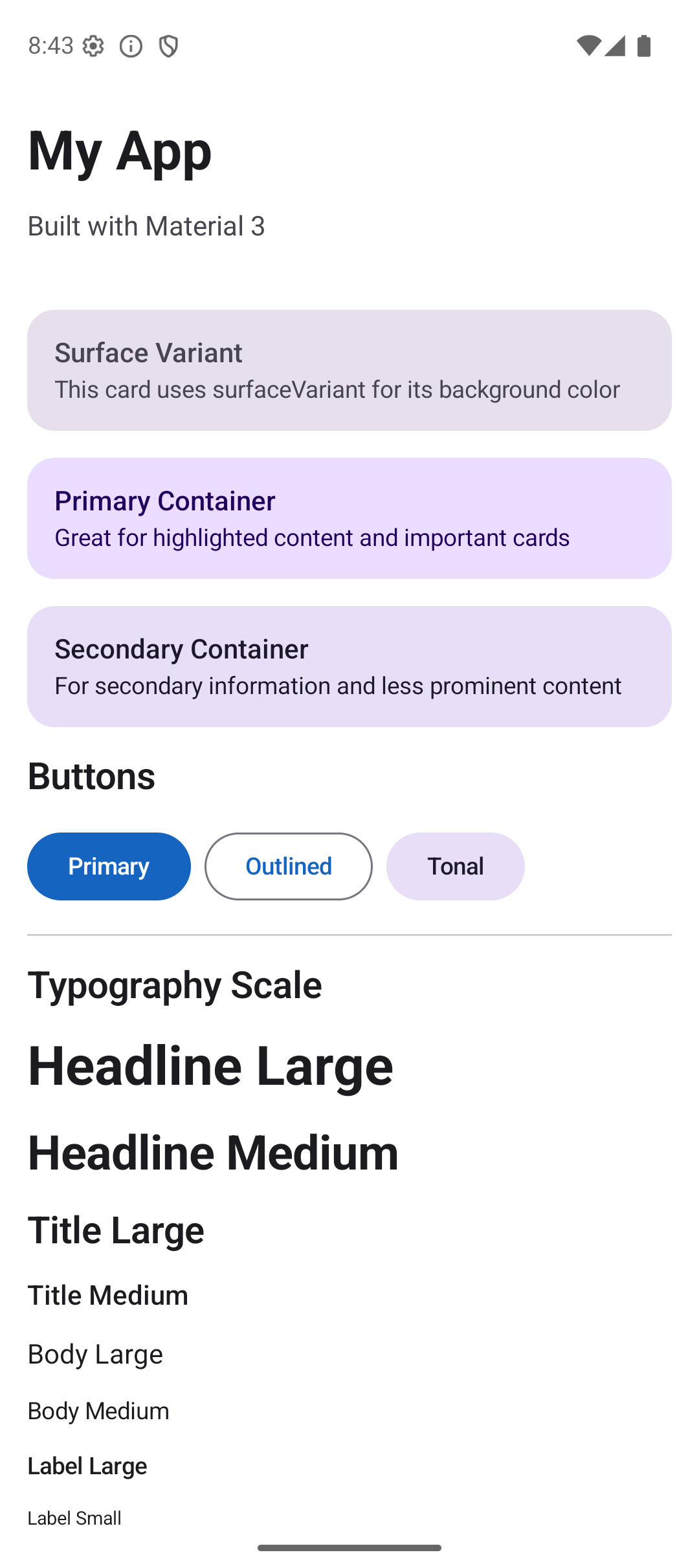
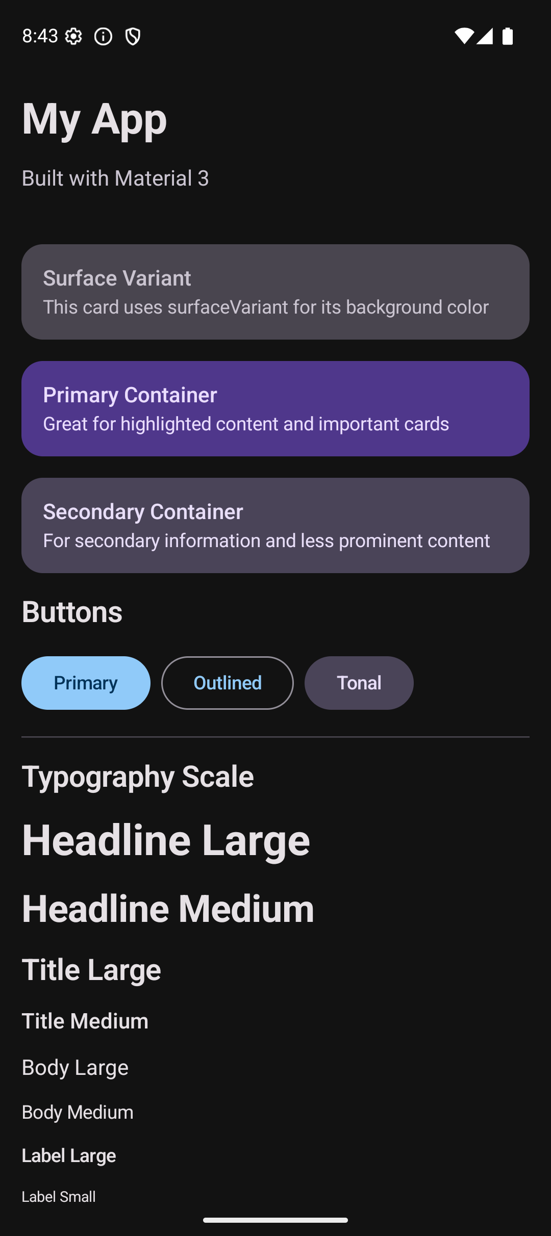
Practical Example: Themed App
Let’s build a screen that shows off the theme — cards, buttons, text styles, and colors all working together:
@Composable
fun ThemedScreen() {
    Column(
        modifier = Modifier
            .fillMaxSize()
            .background(MaterialTheme.colorScheme.background)
            .verticalScroll(rememberScrollState())
            .padding(16.dp),
        verticalArrangement = Arrangement.spacedBy(16.dp)
    ) {
        // Header using typography
        Text("My App", style = MaterialTheme.typography.headlineLarge)
        Text(
            "Built with Material 3",
            style = MaterialTheme.typography.bodyLarge,
            color = MaterialTheme.colorScheme.onSurfaceVariant
        )

        // Card using surface colors
        Surface(
            modifier = Modifier.fillMaxWidth(),
            shape = RoundedCornerShape(16.dp),
            color = MaterialTheme.colorScheme.surfaceVariant
        ) {
            Column(modifier = Modifier.padding(16.dp)) {
                Text("Featured", style = MaterialTheme.typography.titleMedium)
                Spacer(modifier = Modifier.height(4.dp))
                Text(
                    "This card uses surfaceVariant for background",
                    style = MaterialTheme.typography.bodyMedium
                )
            }
        }

        // Primary container card
        Surface(
            modifier = Modifier.fillMaxWidth(),
            shape = RoundedCornerShape(16.dp),
            color = MaterialTheme.colorScheme.primaryContainer
        ) {
            Column(modifier = Modifier.padding(16.dp)) {
                Text(
                    "Primary Container",
                    style = MaterialTheme.typography.titleMedium,
                    color = MaterialTheme.colorScheme.onPrimaryContainer
                )
                Spacer(modifier = Modifier.height(4.dp))
                Text(
                    "Great for highlighted content",
                    style = MaterialTheme.typography.bodyMedium,
                    color = MaterialTheme.colorScheme.onPrimaryContainer
                )
            }
        }

        // Buttons row
        Row(horizontalArrangement = Arrangement.spacedBy(8.dp)) {
            Button(onClick = {}) { Text("Primary") }
            OutlinedButton(onClick = {}) { Text("Outlined") }
            FilledTonalButton(onClick = {}) { Text("Tonal") }
        }

        // Divider
        HorizontalDivider(color = MaterialTheme.colorScheme.outlineVariant)

        // Typography showcase
        Text("Typography", style = MaterialTheme.typography.titleLarge)
        Text("Headline Large", style = MaterialTheme.typography.headlineLarge)
        Text("Title Medium", style = MaterialTheme.typography.titleMedium)
        Text("Body Large", style = MaterialTheme.typography.bodyLarge)
        Text("Label Small", style = MaterialTheme.typography.labelSmall)
    }
}
This screen looks completely different in light mode vs dark mode — but you wrote ZERO code for dark mode. The theme handles everything.
Common Mistakes
Mistake 1: Hardcoding Colors
// BAD — white text is invisible on white background in light mode
Text("Hello", color = Color.White)

// GOOD — adapts to theme
Text("Hello", color = MaterialTheme.colorScheme.onSurface)
Mistake 2: Using Wrong “on” Color
// BAD — onSurface text on primary background is hard to read
Box(modifier = Modifier.background(MaterialTheme.colorScheme.primary)) {
    Text("Hello", color = MaterialTheme.colorScheme.onSurface) // Wrong!
}

// GOOD — onPrimary is designed for primary backgrounds
Box(modifier = Modifier.background(MaterialTheme.colorScheme.primary)) {
    Text("Hello", color = MaterialTheme.colorScheme.onPrimary) // Correct!
}
Mistake 3: Not Testing Dark Mode
Always test your app in both light and dark mode. Use Preview:
@Preview(name = "Light")
@Composable
fun LightPreview() {
    MyAppTheme(darkTheme = false) { ThemedScreen() }
}

@Preview(name = "Dark", uiMode = Configuration.UI_MODE_NIGHT_YES)
@Composable
fun DarkPreview() {
    MyAppTheme(darkTheme = true) { ThemedScreen() }
}
Mistake 4: Ignoring Typography Styles
// BAD — inconsistent font sizes everywhere
Text("Title", fontSize = 24.sp, fontWeight = FontWeight.Bold)
Text("Another title", fontSize = 22.sp, fontWeight = FontWeight.SemiBold)

// GOOD — consistent through theme
Text("Title", style = MaterialTheme.typography.headlineMedium)
Text("Another title", style = MaterialTheme.typography.headlineMedium)
Quick Reference
Color Scheme
| Role | Light Usage | Dark Usage |
|---|---|---|
primary | Main accent color | Lighter version |
primaryContainer | Tinted backgrounds | Darker tinted backgrounds |
surface | Card/sheet backgrounds | Dark card backgrounds |
background | Screen background | Dark screen background |
error | Error indicators | Error indicators |
Typography Scale
| Style | Use For |
|---|---|
headlineLarge | Screen titles |
headlineMedium | Section headers |
titleLarge | Card titles |
titleMedium | Subsection titles |
bodyLarge | Main body text |
bodyMedium | Secondary body text |
labelLarge | Button text |
labelSmall | Captions, timestamps |
Result
Here is what the themed app looks like:
| Light Mode | Dark Mode |
|---|---|
 |  |
Source Code
The complete working code for this tutorial is on GitHub:
Related Tutorials
- Tutorial #3: Modifiers — background, clip, and shape modifiers that work with theming
- Tutorial #4: Components — buttons and text fields that inherit theme colors
- Jetpack Compose Cheat Sheet — quick reference for every component and modifier.
- Full Series: Jetpack Compose Tutorial — all 25 tutorials from zero to publishing.
What’s Next?
Part 1 (Foundations) is complete! In the next tutorial, we start Part 2 (Intermediate) with Navigation — moving between screens using NavHost, NavController, and bottom navigation bars.
See you there.